Analysis of Students' Aptitude to Provide Meaning to Images that Represent Cellular Components at the Molecular Level
Abstract
The number of experimentally derived structures of cellular components is rapidly expanding, and this phenomenon is accompanied by the development of a new semiotic system for teaching. The infographic approach is shifting from a schematic toward a more realistic representation of cellular components. By realistic we mean artist-prepared or computer graphic images that closely resemble experimentally derived structures and are characterized by a low level of styling and simplification. This change brings about a new challenge for teachers: designing course instructions that allow students to interpret these images in a meaningful way. To determine how students deal with this change, we designed several image-based, in-course assessments. The images were highly relevant for the cell biology course but did not resemble any of the images in the teaching documents. We asked students to label the cellular components, describe their function, or both. What we learned from these tests is that realistic images, with a higher apparent level of complexity, do not deter students from investigating their meaning. When given a choice, the students do not necessarily choose the most simplified representation, and they were sensitive to functional indications embedded in realistic images.
INTRODUCTION
The growing number of experimentally solved molecular structures, by nuclear magnetic resonance, x-ray scattering, or cryoelectron tomography, has led to the development of a new semiotic system (Duval, 1995), characterized by an increased use of realistic representations of cellular components in lecture slides and textbooks. By realistic, we mean representations of cellular objects that resemble the experimentally determined structure. These realistic representations may be the direct product of molecular graphics programs, or they may be artists' impressions of experimentally determined structures (Goodsell and Johnson, 2007).
The adjective “realistic” is normally used for macroscopic objects and refers to a true-to-nature representation, devoid of any styling or simplification (Giordan and Martinand, 1988). Because of direct visual references, realistic images of everyday life objects are generally easy to understand. For micro- or nanoscale objects (referred to as microscopic objects), realistic still means “true-to-nature” or “natural,” but from a cognitive point of view the situation is quite different. Unlike macroscopic objects, microscopic objects cannot be observed by the naked eye. They require the intermediate of experimental techniques and computer-aided image processing. The resulting image acts as an intersemiotic medium, in between the object and the experimental data, both of which are neither visible nor comprehensible by the unaided eye. The depiction of microscopic objects is therefore necessarily “representational” and thus always highly abstract; whether realistic or not, they always lack a direct visual reference. This implies, with reference to the cognitive load theory, that cell and molecular biology images, being schematic, simplified or realistic, always carry a high intrinsic cognitive load (i.e., difficult to understand; Chandler and Sweller, 1991; Sweller et al., 1998) because these images require a thorough understanding of numerous iconic (object represents a molecule) and scientific codes (object represents an enzyme involved in a metabolic process or a receptor involved in a signaling cascade) to be meaningful (Johnstone, 1991).
We discern three major forces that support the adoption of realistic images. First, structural analysis provides a much more meaningful understanding of the functioning of cellular components (Lewontin, 2003; Nye, 2004) and in particular of proteins. Indeed, showing similar lipid bilayer-embedded carrots that transport either K+, Ca2+, or water may help in conveying the notion that membrane transport is mediated by transmembrane proteins, but it does not provide any clue as to their selectivity or their mode of action. In this respect, elaboration of just one example, for example, the K+ channel and its selectivity filter (Zhou et al., 2001), may be revealing for many students and help them to understand that different membrane proteins harbor different functions because they have different molecular qualities. Second, cellular components are rarely made up of a single protein, and even cellular processes, whether dealing with metabolic events or with the relay of signals, involve multiprotein complexes. Trying to group together numerous proteins with different functions and binding domains in an image that reflects all these properties seems almost impossible, and one quickly poses the question: What does it look like in “real” life? Last, many teachers, in particular those who regularly update their lecture content, have a tendency toward the inclusion of state-of-the-art molecular representations because they reflect better their own level of understanding (i.e., teachers often behave as students of their own subject). This tendency is enthused by the ample supply of freely available state-of-the-art teaching illustrations distributed by numerous publishers of science review journals.
In our cell biology multimedia resources (Kramer/Tramu), we, too, have shifted toward more realistic images (see www.cellbiol.net, section Cell Biology Education, item Teaching Illustrations). In addition to the above-mentioned arguments, we felt that if students are to be prepared for the postgenomic era, characterized by an explosion of genes, gene products, and structure–function analyses, they should be confronted with this new infographic approach in an early stage to prevent a very steep learning curve in the last part of their studies. Furthermore, we argued that certain “classic” schematic representations may provide an unjust picture of our current understanding and may contribute to the acquisition of faulty mental models, which at a later stage will be difficult to erase (Duval, 1995). For example, antiport cotransporters are sometimes represented as proteins that rotate within the membrane, but we now know that such mode of transport would be impossible from an energetic point of view. Finally, realistic images may have the advantage of accompanying the learner for a longer period of his or her learning path because they resemble the structural images presented in scientific articles that they certainly are going to confront at a later stage of the curriculum.
Arguments against realistic images also are numerous. First, there is the problem of prerequisites: Understanding a “cartoon” representation of a protein, based on coordinates from an x-ray diffraction, requires a good understanding of what proteins are: their nature, their order, and the length of the amino acid chain and their linkage through peptide bonds. Students also require an understanding of the iconic and chemical conventions that underlie this graphic representation (e.g., backbone representation, α-helix and β-sheet arrangements of amino acids, and hydrogen bonds). Then, there is the problem of distinguishing between different iconic representations of the same object: Students must differentiate a cartoon representation from other representations, such as “stick,” “sphere,” or “surface,” but they must understand that they all represent one and the same protein. Students have to understand that some representations are hypothetic and others are not. Often, scientific illustrations are “collages” in which structures derived from x-ray analysis, artist impressions of these structures, and hypothetical structures (because not all structures are known by far) are freely mixed, which adds an extra level of complexity. Furthermore, realistic representations may become very dense when different proteins are represented in one image, rendering them mentally inaccessible (like dense forests preventing access of ramblers). Students need to have a good sense of scale for a meaningful understanding of realistic images: The image has to prevent confusion between the size of ATP and a 110-kDa Ca2+-ATPase. Use of realistic images forces teachers to use multimedia techniques (e.g., prepared slides on computers) during the lectures, and some have chosen not to follow this didactical approach (Voss et al., 2004). A common criticism is that students cannot draw the proteins for themselves, and this would lead to a more passive approach to teaching. Finally, some teachers are reticent simply because they themselves fail to provide meaning to the changing infographic approach and lack the molecular graphic and multimedia skills necessary to embark on the transformation process.
For any of these reasons, numerous teachers at University of Bordeaux-1, and elsewhere, oppose realistic images and herald keeping things simple for first-year introductory courses because the illustrations only have to convey the “basic principles and concepts” of cell biology.
Although the above-mentioned arguments are all valid from a teacher's point of view, what really matters is how students “handle” the different type of images, i.e., to what extent are they able to follow our argumentation? Do they prefer schematic and simplified illustrations, or are impressive realistic images more challenging? This is why we set out to investigate the students' aptitude to provide meaning to images that represent molecular components of the cell at different levels of “reality.” We offered students images that were related to the lecture content but without bearing strong resemblance to the images provided in the handout or multimedia resources. They had to label components and describe the function of the depicted structures. Using these images, we assessed the following points:
Are realistic images, because of their apparent complexity, more difficult for students to interpret?
Are students able to make sense of decontextualized images, and if so, what kind of information do they extract and how do we explain their aptitude?
METHODS
Description of Test Groups
We performed the tests at the University of Bordeaux-1 (Talence, France) with two populations of students. The first population consisted of first-year biology students in their second semester of the Life and Environmental Sciences course (Science de la Vie et l'Environnement [SVE]). In this course, knowledge is assessed in three in-course assessments (two image tests and one multiple-choice question [MCQ] test) and one final exam (MCQ only). The retention rate of the first exam session for the cell biology module was 66% (i.e., 66% of the students had a course mark of 10 or higher on a 20-point scale). The students have attended a 60-h module of general chemistry, in the semester preceding the cell biology course, in which the composition of biological molecules, the characteristics of chemical bonds, and the different types of molecular interactions were described.
The second population consisted of students selected on the basis of their CV (Cycle Preparatoire de Bordeaux [CPBx]). These students follow a different curriculum, with a strong emphasis on mathematics, physics, and chemistry. The cell biology course also is given in the second semester, and the content is identical, given by the same teacher (Kramer) and supported by the same teaching documents. In this course, knowledge is assessed by one in-course assessment (image test) and one final exam (composed of MCQs and one essay question). The retention rate of the first exam session of this cohort was 97%.
Surprisingly, despite the different backgrounds of the two populations, when comparing their marks for the cell biology course (in-course assessments plus exam), we found no significant difference between them (Figure 1). Thus, we combined the results of both groups when analyzing correlations between the choice of images and concomitant test results.
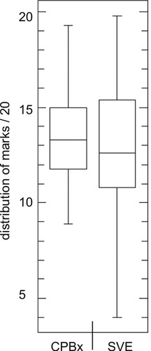
Figure 1. Cell biology course marks of the CPBx and SVE student population. The image tests were performed in two populations of students: one population selected on CV (CPBx, a cohort of 32) and one population accepted on the sole criterion that the students had passed the national exam at the end of secondary school education (SVE, a cohort of 122). We compared the cell biology course marks of the two populations and found that although the amplitude varied considerably, with the CPBx being much more homogeneous, the mean course mark did not differ significantly between the populations. The results are presented in a box plot that indicates the lowest mark (lower bar); the lower, median, and upper quartile (box); and the highest mark (upper bar). The left box plot represents 34 students and the right box plot represents 92 students.
Description of the Cell Biology Course at Bordeaux-1
The course comprises lectures (27 h), practicals (30 h), and five tutorials (6 h). The lecture course is accompanied by a handout and nine multimedia resources (collectively named teaching documents). The multimedia resources, in French, can be freely accessed through www.cellbiol.net, section Cell Biology Education, item Multimedia Resources. With respect to the multimedia resources, our concern was to provide a rich learning source that would 1) allow us to replace lecture time with other teaching activities, such as short active-learning projects and frequent in-course assessments; and 2) be useful to students throughout their learning path. The resources therefore comprise a main text body, essential for the first year, but also side notes, excursions, references of important articles, and often, links to laboratories, aspects that may be of interest for students at a later stage in their curriculum. The resources are embedded in a “course contract,” for which first-year students sign up at the start of the semester. This contract provides them with a course program, a list of instructions and activities (course guide), and material for the tutorials.
We chose to present the cell biology course in a “construction-of-a-cell” sequence (resources 1–11), starting with the membrane (creation of a privileged environment) (1), followed by transport proteins (2) and adhesion molecules and the extracellular matrix (3). We continue with the description of the cytoskeleton (4) in the context of cell and tissue integrity and make an excursion to the organization of muscle tissue. We then describe the role of the mitochondria (5) in the production of ATP (and elaborate on the role of insulin, glucagon, and adrenaline in the metabolism of glucose/glycogen and fatty acids/triglycerides). We next explain how the cell makes protein (6) and how protein degradation provides a highly dynamic equilibrium. In 7 and 8, we describe the routing of newly synthesized protein to the different organelles and to the extracellular environment. Endocytosis and exocytosis are discussed in this context. Then, we discuss how cells communicate with their environment, in particular, the role of receptors and signal transduction therein (9), and how these signals affect gene transcription (10) and may result in growth factor-mediated signaling, and in DNA replication, giving rise to a round of cell division (11). From protein synthesis onward, the resources contain increasing numbers of images with realistic representations of proteins. The structure–function relationship is discussed extensively in 9, dealing with receptors and signal transduction. To get a better impression of the level of molecular detail in the resources, we suggest consulting the English version of our cell biology images on the ImageBank at www.bioscience.heacademy.ac.uk/imagebank, search for “IJsbrand Kramer.” Pedagogical arguments for a realistic iconographic approach are outlined in the Introduction of this article. Finally, the practical that accompanies the lecture course deals with classic histology, recognition of tissues, and analysis of electron microscopic images of cells and their organelles.
Test Format
We chose to present the image tests in the form of 35-min in-course, summative knowledge evaluations (in-course assessments). We felt that this not only would increase the involvement of the students who tend to be rather short-term, reward-oriented but also would prevent a bias toward testing the students' aptitude in a selected “cooperative” or “enthusiastic” group, rather than a cross-section of the cohorts. Moreover, we had learned from 4 yr of experimenting with different course formats that repetitive in-course assessments (applied every six lectures) are most effective in increasing the retention rates of the SVE population (an increase from 34% in 2004 to 66% in 2008), and these tests suited perfectly the purpose of getting them to work (also see Freeman et al., 2007). The tests were performed in the first 4 wk of the lecture course, roughly 2 wk after the subjects (plasma membrane and membrane transport) were treated in the lecture theater. The students were informed about the mode of evaluation and were given precise instructions about the teaching documents they had to review to succeed on the test.
Image Format
The illustrations were either obtained through an image search by Google and modified for our purpose, or they were prepared by us using PyMOL (Delano Scientific, Palo Alto, CA) starting from Protein Data Bank coordinates (pdb files) (Berman et al., 2000). As indicated, none of the images resembled the images in the handout. We chose this approach for two reasons: 1) to prevent students from choosing images that correspond to the images used by the teacher to please or not confront the teacher (or vice versa) or because they expect to get a better mark; and 2) to avoid a “conditioned” reply, i.e., students are so familiar with the image that they can fill in the questions without even having to study it. We deliberately omitted titles and legends because we wanted, as much as possible, the iconic signs to “speak for themselves.” The images of the teaching documents that correspond to the test images in question are shown in Figures 2a, 3a, and 4a).
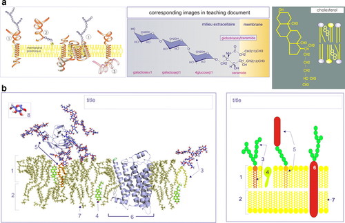
Figure 2. Realistic versus schematic representation of the plasma membrane. (a) Course images of the plasma membrane; three relevant images from the teaching document are shown. (b) Test images of the plasma membrane: left, realistic representation and right, schematic representation. The membrane components in the realistic representation are all based on experimentally derived structures. The phospholipid bilayer coordinates were obtained from equilibrated structures after molecular dynamics simulation (N. Taib), and the coordinates of the Thy1-glycosylated peripheral membrane protein were provided by M. Wormald. The structure of the β2-adrenergic receptor (pdb: 2rh1) (Cherezov et al., 2007) and of cholesterol (pdb: 1ssj) (Gómez-Pinto et al., 2004) were obtained from the Protein Data Bank. The glycerol-glycolipid is a compilation of diacylglycerol combined with one of the sugar chains of Thy1 (an Adobe Photoshop cut-and-paste preparation). The schematic representation was found on the Web and modified for our purposes. Students had to provide a title [cell membrane, lipid bilayer with (glycol)proteins] and label the numbered components: 1) membrane outer leaflet, 2) membrane inner leaflet, 3) glycerol-glycolipid, 4) cholesterol, 5) glycosylated peripheral-membrane protein (Thy1), 6) transmembrane protein (β2-adrenergic receptor), 7) phospholipid, and 8) sugar or hexose (only in realistic representation). In the schematic representation test, students had to decipher the iconic code for the green (sugar or hexose) and yellow (phospholipid headgroups) spheres. Finally, they were asked to provide a stick representation of a phospholipid.
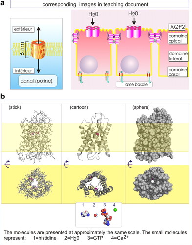
Figure 3. Different realistic representations of aquaporin. (a) Course images of aquaporin: two relevant images from the teaching document are shown. (b) Test images of aquaporin: stick, cartoon, and sphere representations were obtained by using the same structural coordinates (pdb:1fqy). The yellow band represents the plasma membrane. Protein is viewed both in a cross-section (top) and in the plane of the membrane (bottom). Sphere representations of histidine, H2O, GTP, and Ca2+ are shown below for scale purpose. The students were asked about the nature of the object (pore containing protein), its subcellular localization (membrane), and the special requirements of the object to colocalize with the cellular component represented by the yellow band (segment compatible with a hydrophobic environment, composed of predominantly nonpolar or aromatic amino acids). They then had to choose one of the representations that reflected best the assumed function of the object (membrane transport protein in the form of a porin, channel- or pore-forming membrane protein).
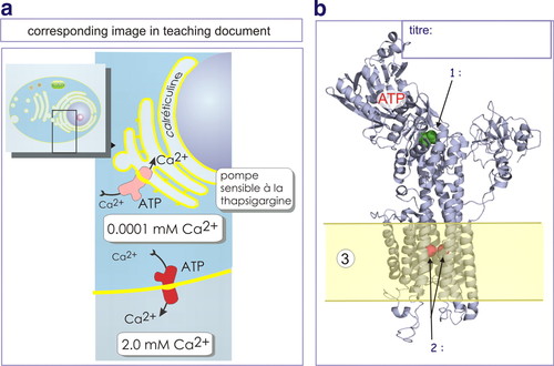
Figure 4. Realistic representation of the smooth endoplasmic reticulum Ca2+-ATPase (SERCA). (a) Course image of the Ca2+-ATPase; one relevant image from the teaching document is shown. (b) Test image of the Ca2+-ATPase (SERCA); the students had to provide a title (Ca2+-ATPase or Ca2+ pump) and name the indicated objects: 1) aspartate-351 or amino acid to be phosphorylated, 2) Ca2+ ions (or transported ions), and 3) cell membrane (sarcoplasmic reticulum). They also had to indicate the nature of the protein segment that colocalizes with the yellow band (transmembrane section of protein, hydrophobic, composed of predominantly nonpolar or aromatic residues). The structure coordinates were obtained from pdb: 1eul.
Realistic or Schematic Representation of the Plasma Membrane
The students either received a realistic or a highly schematized image of the plasma membrane (lipids and [glycol]proteins) (Figure 2b). The components of the realistic image were all prepared from experimentally derived coordinates. The phospholipid bilayer coordinates were obtained from equilibrated structures after molecular dynamics simulation and were kindly provided by Dr. N. Taib (Institut Européen de Chimie et Biologie, University of Bordeaux, Bordeaux, France). The coordinates of the Thy1-glycosylated peripheral membrane protein were kindly provided by Dr. M. Wormald (Oxford Glycobiology Institute, University of Oxford, Oxford, United Kingdom). The structure of the β2-adrenergic receptor (pdb: 2rh1) (Cherezov et al., 2007) and of cholesterol (pdb: 1ssj) (Gómez-Pinto et al., 2004) were obtained from the Protein Data Bank. The glycerol-glycolipid is a compilation of diacylglycerol combined with one of the sugar chains of Thy1 (a cut-and-paste preparation from Adobe Photoshop; Adobe Systems, Mountain View, CA). It should be noted that glyco-sphingolipids are normally more abundant, but we have no dynamic structure of sphingosine.
The schematic representation was characterized by very few iconic signs. These were limited to spheres and lines of different colors and different shapes, representing lipids, proteins, and sugars. We added a glycerol-glycolipid, with the use of the same iconic signs. For both images, students were asked to provide a title, and they had to name the indicated membrane components. They also had to decipher the iconic code for the green (sugar) and yellow (phospholipid headgroup) spheres. To find out what (mental) image the students themselves had constructed of phospholipids, we next asked them to draw a more detailed stick representation (using C, H, O, and P symbols; data not shown).
Different Types of Realistic Representations of Aquaporin
We offered the students three molecular graphic (PyMOL) representations (stick, cartoon, and sphere, respectively) of aquaporin-1 (pdb: 1fqy) (Murata et al., 2000; Figure 3b). For our own orientation purposes, two amino acids in the upper constriction region of the channel (important in the selection of cargo that crosses the protein) were highlighted in purple. For the sphere representation, we distorted the water channel slightly, by removing cystein-189, so that you see through the protein more easily from the plane of the membrane (inclusion of a didactic lie; also see Goodsell and Johnson, 2007). To provide a necessary sense of scale, we have added sphere representations of histidine, water, guanosine triphosphate (GTP), and calcium. We asked several questions about the nature of the object (pore-containing protein) and its cellular localization (membrane). We then asked the students to choose one of the representations that reflected best its assumed function (e.g., membrane transport protein). Students could, without too much guessing, identify the protein because the relevant teaching document for this exercise (resource 2, membrane transport) only describes a restricted number of membrane transport proteins. The students had a choice between a pump (ATP driven), a cotransporter (sodium-dependent glucose cotransporter), a transporter (aquaporin and glucose transporter), or an ion channel (K+ or acetylcholine receptor). To help them further, in this particular resource, only transporters and cotransporters were depicted as cylindrical proteins (Figure 3a); all the others had more elaborate structures (multisubunit complexes) and were always illustrated together with the necessarily cofactors (ATP, Na+, or the neurotransmitter acetylcholine; Figure 4a).
For 30 students, we provided a slightly different test: we mentioned the identity of the protein (aquaporin) because we wanted to find out whether the arguments for the choice of the image would differ. We had learned from course tutorials that, when not knowing the protein, students naturally focused largely on structural arguments (e.g., symmetrical, transmembrane, and helical configuration) and not functional arguments (e.g., transport, selectivity, active or passive).
Note. The second aquaporin image is a cartoon representation, but this term should not be confused with a “sketchy representation” of an object. The molecular graphics program PyMOL distinguishes between “ribbon” and cartoon representations. Both essentially show the protein backbone, but in the cartoon, helixes and β-sheets, unlike loops, have the characteristic flat appearance.
Schematic and Realistic Representations of Ca2+-ATPase
Here, we provided the students with a cartoon representation of the crystal structure of muscle smooth endoplasmic reticulum Ca2+-ATPase (SERCA; pdb: 1eul; Toyoshima et al., 2000) and asked them to provide a title, to name the aspartate-351 residue (which is transiently phosphorylated), the two Ca2+ ions captured inside the channel, and the plasma membrane (Figure 4b). They next had to choose between three different representations of the same protein (schematic topology, schematic explanative, or realistic explanative) and describe its mode of action (Figure 5). The multimedia resource dealing with protein transport, which the students were assigned to consult before the test, contains an animation in which the link between transient phosphorylation, a change in protein conformation, and the transport of Ca2+ is emphasized.
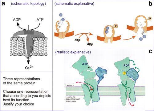
Figure 5. Different representations of the Ca2+-ATPase: schematic topology (a), schematic explanative (b), and realistic explanative (c). After having seen the realistic representation of Ca2+-ATPase (see Figure 4b), the students were offered three representations of the Ca2+ pump (schematic topology, schematic explanative, or realistic explanative). They had to choose one of them. They had to justify their choice in the description of the function of the protein. All three images were obtained from the Internet and adapted for our purposes.
The aquaporin and Ca2+-ATPase tests were performed simultaneously, during the same in-course assessment exercise, with half of the students assigned to each image. The two plasma membrane images also were treated simultaneously but earlier in the course. A mixed image approach is necessary to avoid cheating.
Depiction of Numerical Data and Statistical Analysis
The results of the image tests are presented in box plots. These plots indicate the lowest mark (lower bar); the lower, median, and upper quartile (box); and the highest mark (upper bar). This type of representation provides a good impression of the distribution of marks. The significance of the differences between the data sets was estimated using the Student's t test, with the Web-based calculation program of Kirkman at www.physics.csbsju.edu/stats.
RESULTS
Recognition of Plasma Membrane Components
When provided with either a realistic or a schematized representation of components of the plasma membrane, students had no difficulty in recognizing the lipid bilayer and its transmembrane protein component. They had more difficulty in recognizing the glycerol-glycolipid, the glycosylated peripheral membrane protein (Thy1), or cholesterol (Figure 2b and Table 1). With respect to the sugars, 75% of the students recognized the stick representation (eight), and 76% recognized them as being represented by the green spheres (in the schematic image). The ease of recognition of phospholipids was reflected by the majority of students being able to provide a correct stick representation (last line of Table 1). We note that the schematic representation provoked more incorrect alternative propositions (17) than the realistic representation (eight). We compared the distribution of marks between the two tests and found that they differed only slightly. The median value for the realistic representation (horizontal bar in box) is 15.7/20, whereas a median of 16.0/20 was obtained for the schematic image. The p value for the two marks was 0.73, which indicates a nonsignificant difference (Figure 6).
| Realistic representation (18) | Schematic representation (18) | |||
|---|---|---|---|---|
| Correct reply, % | Alternative propositions | Correct reply, % | Alternative propositions | |
| Title of image | 93 | — | 82 | |
| 1. Outer leaflet | 88 | — | 88 | Polypeptide chain (1) |
| 2. Inner leaflet | 88 | — | 88 | Polypeptide chain (1) |
| 3. Glycerol-glycolipid | 56 | Adhesion molecule (1), peripheral membrane protein (2) | 41 | Peripheral membrane protein (2), glycerol (1), glycocalyx (1), transmembrane protein (1) |
| 4. Cholesterol | 87 | Collagen | 70 | Integrin (1), collagen (1), transporter (2), channel (1) |
| 5. Glycosylated peripheral membrane protein (Thy1) | 69 | Receptor | 88 | |
| 6. Transmembrane protein (β2-adrenergic receptor) | 100 | — | 100 | |
| 7. Phospholipid | 100 | — | 94 | Sphingolipid (1) |
| 8. Sugar or hexose | 75 | Amino acid (1), glycerol (1), collagen (1) | ||
| Green sphere (sugar or hexose) | 76 | Amino acid (2), glycogen (1) | ||
| Yellow sphere (phospholipid headgroup) | 82 | Glycerol | ||
| Mean of test | 15.7/20 | 16.0/20 | ||
| No. of correct stick representations of a phospholipid | 11 | 15 | ||
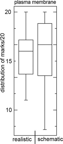
Figure 6. Student marks of the plasma membrane image test: realistic versus schematic. Students were confronted either with a realistic or a schematic representation of the plasma membrane. They had to label the different components and describe in more detail the composition of the phospholipids. The median test-marks of students who confronted a realistic (left) or a schematic (right) representation of the plasma membrane did not differ greatly. The amplitude of variation is less in the case of realistic images and this corresponds to a lower number of incorrect propositions (fewer “guesses”; see Table 1). The image-test marks are presented in a box plot that indicates the lowest mark (lower bar); the lower, median, and upper quartile (box); and the highest mark (upper bar). The median value is indicated by the horizontal bar in the box. The left (realistic) and right (schematic) boxes represent 18 students each.
Different Representations of Aquaporine
The aim of the exercise was to analyze whether students take functional arguments into account in choosing a suitable representation of a membrane transport protein. Starting from a Protein Data Bank file, we prepared three different realistic representations of aquaporine: one image that depicts the protein in sticks, a representation that we regarded not very useful because of lots of unnecessary detail; a second image that depicts the protein in cartoon, a representation that nicely shows the helical structures of the transmembrane segment, but with an unrealistically large pore (because only the backbone representation of amino acids); and a third image that depicts the protein in spheres. We chose the latter image to illustrate the tiny transition pore, which, for size reasons, cannot accommodate GTP or histidine (molecules that were added to the figure for scale purposes; see Figure 3b, bottom).
The students easily recognized the yellow plasma membrane and identified the “gray object” as a protein (Table 2). Nearly half the group proposed that the protein plays a role in solute exchange across the membrane. A few students erroneously thought that it represented a pump. The majority had selected the cartoon representation and used structural arguments that emphasized the transmembrane characteristics of membrane-embedded proteins (e.g., typical membrane spanning α-helices). The second most popular choice was the sphere representation, and here students provided relevant functional arguments, e.g., transition pore for small solutes because of size restrictions.
| What biological molecule is represented by the gray object? | Protein (72%), histidine, lipid, pore, oxygen | |
| What cellular component is represented by the yellow band? | Membrane (87%), extracellular matrix, cytoplasm | |
| With respect to the nature of the gray object, are there special requirements to colocalize with the cellular component represented by the yellow band? | Compatible with hydrophobic environment (predominantly nonpolar amino acids, some polar uncharged) | |
| What is the function of this protein and which representation reflects best this function? | ||
| Major replies | Minor replies | |
| Exchange (49%) | Adhesion | |
| Pump (13%) | Cohesion between cell and its organelles | |
| No reply (19%) | Procures rigidity and permeability to membrane | |
| Image chosen | % of students | Justification of choice |
|---|---|---|
| Stick | 8% | Shows nicely the geometry of the channel |
| Cartoon | 51% | Shows accessibility of ligand |
| Shows site of modification of the transmembrane portion (red spheres at pore entry sites) | ||
| Shows interaction with the membrane | ||
| Illustrates channel qualities | ||
| Shows helical nature of transmembrane protein | ||
| Shows the pore | ||
| Shows that the channel-components can move | ||
| Shows the ligand binding site | ||
| Shows the spatial organization of the channel | ||
| Shows that the pump is made up of transmembrane proteins | ||
| Clearly shows the transmembrane helices (composed of hydrophobic amino acids) arranged in a circle with in the middle a hole | ||
| Illustrates best the channel formed by the protein | ||
| Sphere | 41% | Reveals the tube structure |
| Reveals the narrow tunnel | ||
| Reveals the narrow pore | ||
| Allows for a better understanding of selectivity of transport (scale of cargo) | ||
| Illustrates the gradient |
In the second test, using the same representations but with mention of aquaporin, the favored choice shifted overwhelmingly toward the sphere representation. This was accompanied by an increase in functional arguments, with an emphasis on size restriction (i.e., one of the molecular aspects that determines selectivity of transport; Table 3).
| Image chosen | Mention of aquaporin (%) | Justification |
|---|---|---|
| Stick | 3.3 | Shows the histidine and GTP, both involved in the capture of water |
| Cartoon | 30 | Reveals the transmembrane nature of the protein (helices that traverse the lipid bilayer) |
| Shows the spatial organization of the different proteins and the lumen they create; this lumen represents the function of the protein, which is made to let (the clearly visible) water molecules pass | ||
| Shows that water can pass but ions are excluded | ||
| Shows that the channel can widen and close, thereby regulating water transport | ||
| Sphere | 66.7 | Clearly illustrates that water, but not other molecules shown, is able to pass the narrow pore |
| Reveals that the specificity of aquaporin lies in part in the diameter of its pore and this is best illustrated by this representation | ||
| Reveals that it cannot be a pump because it lacks an ATP-binding site | ||
| Reveals that the pore has more or less the size of a water molecule | ||
| Reflects the function of the protein; selective transport of water |
Students Who Chose the Sphere-Representation of Aquaporin Scored Better in the Image Test as Well as in the Ensemble of Graded Assessments
We next assessed whether the image choice was associated, either positively or negatively, with student performance. Students who selected the sphere representation of aquaporin scored much better in the test, with a median value of 16 (horizontal bar in the box) compared with a median value of 13 for students who selected the cartoon representation (Figure 7a). The p values for the two sets of data were 0.01, which indicates a highly significant difference. This relationship also was revealed when comparing overall course marks, with a median value of 14.3 versus 11.9 and a p value of 0.018 (Figure 7b). Only three students chose the stick representation (with marks 11, 13.3, and 20, respectively), which made a statistical comparison not very meaningful.
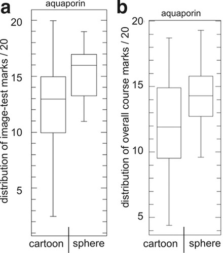
Figure 7. Relationship between the students' choice of aquaporin image and their performance in the test and in the overall course. Students were offered three different representations of aquaporin (see Figure 3b). They were asked to choose one of the images and describe the nature, location, and possible function of the protein. The majority of students chose either a cartoon or sphere representation. We compared the median image-test mark of students who chose a cartoon or sphere representation and found that those who chose a sphere representation scored much better (a). A similar choice-score relationship applies for the overall course mark (b). Moreover, students who chose the sphere representation provided relevant functional arguments, rather than just a structural description of the protein (see Table 2). The image-test and course marks are presented in a box plot that indicates the lowest mark (lower bar); the lower, median, and upper quartile (box); and the highest mark (upper bar). The median value is indicated by the horizontal bar in the box. The left box (cartoon) represents 30 students, and the right box (sphere) represents 37 students.
Different Representations of Ca2+-ATPase
The aim of this exercise was twofold. First, we wanted to know what students could extract from a realistic, x-ray structure-based representation of the Ca2+ pump (SERCA; Figure 4b); and second, having seen the structure of the protein, we wanted to know what schematic representation students would select to accompany their description of its mode of action? We had chosen three different types of images: one image that revealed the essential ingredients but did not reveal the process (schematic topology), one image that illustrated the process (component behavior) but showed a totally inappropriate representation of the shape of the protein (schematic explanative), and a third image that represented the current understanding of both shape and mode of action (realistic explanative; terms from Mayer and Gallini, 1990; Figure 5).
The majority (79%) of students discerned the identity of the protein—an ATPase involved in transport. Less than half (48%) of the students identified the green spheres as the phosphorylation site, and just over half (59%) recognized the two calcium ions (Table 4). All students recognized the structure represented by number 3—membrane or lipid bilayer. The list of alternative propositions reveals important errors, both with respect to the scale of the different components and their iconic representation. For instance, spheres representing single amino acids were confused with macromolecular structures such as whole proteins or cholesterol. Others wrote that the spheres represented covalent bonds (because they had picked up from the lectures/handout that covalent modification of proteins could induce conformational changes?).
| Name indicated objects | Correct reply, % | Alternative propositions | ||||||||||||||||||||||||||||||||||||||||||||||||||||||||||||||||||
|---|---|---|---|---|---|---|---|---|---|---|---|---|---|---|---|---|---|---|---|---|---|---|---|---|---|---|---|---|---|---|---|---|---|---|---|---|---|---|---|---|---|---|---|---|---|---|---|---|---|---|---|---|---|---|---|---|---|---|---|---|---|---|---|---|---|---|---|---|
| Title, Ca2+-ATPase | 79 | Transmembrane protein | ||||||||||||||||||||||||||||||||||||||||||||||||||||||||||||||||||
| DNA polymerase | ||||||||||||||||||||||||||||||||||||||||||||||||||||||||||||||||||||
| 1. Aspartate or phosphate or phosphate-binding site | 48 |
| ||||||||||||||||||||||||||||||||||||||||||||||||||||||||||||||||||
| 2. Two Ca2+ | 59 | K+ | ||||||||||||||||||||||||||||||||||||||||||||||||||||||||||||||||||
| Phosphate receptor | ||||||||||||||||||||||||||||||||||||||||||||||||||||||||||||||||||||
| β-catenin (adhesion molecule complex) | ||||||||||||||||||||||||||||||||||||||||||||||||||||||||||||||||||||
| Cholesterol | ||||||||||||||||||||||||||||||||||||||||||||||||||||||||||||||||||||
| Peptide bond | ||||||||||||||||||||||||||||||||||||||||||||||||||||||||||||||||||||
| Hydrogen bond | ||||||||||||||||||||||||||||||||||||||||||||||||||||||||||||||||||||
| Phosphor | ||||||||||||||||||||||||||||||||||||||||||||||||||||||||||||||||||||
| Substrate | ||||||||||||||||||||||||||||||||||||||||||||||||||||||||||||||||||||
| Protein | ||||||||||||||||||||||||||||||||||||||||||||||||||||||||||||||||||||
| 3. Membrane or lipid bilayer | 100 | |||||||||||||||||||||||||||||||||||||||||||||||||||||||||||||||||||
| What is the nature of the segment that colocalizes with the yellow band? (hydrophobe, apolar, composed of predominantly hydrophobic amino-acids, compatible with lipid environment) | 73 |
| ||||||||||||||||||||||||||||||||||||||||||||||||||||||||||||||||||
With respect to the choice of the images (Figure 5), the realistic explanative representation of Ca2+-ATPase seemed to be most satisfying (selected by 56% of the students; Table 5). The arguments justifying their choice can be summarized as “an appropriate illustration of the dynamic process” (e.g., opening and closing, transient phosphorylation, conformational changes). None of the students argued that the realistic explanative representation resembles more closely the crystallographic structure presented in Figure 4b.
| Representation chosen | % of students | Justification of choice, shows | ||||||||||||||||||||||||||||||||||||
|---|---|---|---|---|---|---|---|---|---|---|---|---|---|---|---|---|---|---|---|---|---|---|---|---|---|---|---|---|---|---|---|---|---|---|---|---|---|---|
| Schematic topology | 14 |
| ||||||||||||||||||||||||||||||||||||
| Schematic explanative | 30 |
| ||||||||||||||||||||||||||||||||||||
| Realistic explanative | 56 |
| ||||||||||||||||||||||||||||||||||||
Students Who Chose the Explanative Representations of Ca2+-ATPase Scored Much Better in the Image Test but Only Moderately Better in the Overall Course
We next assessed whether the choice of the image was associated with student performance. Students who selected one of the two explanative representations scored much better (median value of 14.8 and 15.0, respectively) than those who selected the topology-only version (median value of 11.0). The p values are 0.013 (schematic explanative vs. schematic topology) and 0.031 (realistic explanative vs. schematic topology; Figure 8a). When comparing image choices with overall course marks, the differences were less pronounced (Figure 8b), with only a slight gain for those who chose an explanative representation, with p values of 0.093 (schematic explanative vs. schematic topology) and 0.16 (realistic explanative vs. schematic topology).
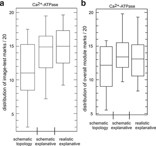
Figure 8. Relationship between the students' choice of Ca2+-ATPase image and their performance in the test and in the overall course. Students were offered three different representations of a Ca2+-ATPase (see Figure 5) and were then asked to describe the nature, subcellular location, and possible function of the protein. The majority of students (56%) chose the realistic explanative representation, 30% opted for the schematic explanative, and 14% for the schematic topology version (see Table 4). When comparing the median mark of the image test of all students who chose schematic topology, schematic explanative, or realistic explanative, we noticed a significantly lower score for students who chose the schematic topology representation of the Ca2+-ATPase (a). With respect to the overall course mark, none of the median marks were significantly different (b). The image-test and course marks are presented in a box plot that indicates the lowest mark (lower bar); the lower, median, and upper quartile (box); and the highest mark (upper bar). The median value is indicated by the horizontal bar in the box. The left box (schematic topology) represents eight students, the middle box (schematic explanative) represents 17 students, and the right box (realistic explanative) represents 31 students.
DISCUSSION
Realistic Representations Are Not Necessarily More Difficult
Although quite different with respect to their iconic codes, students who confronted a realistic representation of the plasma membrane performed equally well as those who confronted a schematized representation. For the realistic representation, we scored fewer erroneous replies and more nonreplies, as if students were less tempted to guess. The test result of the realistic image is rather revealing. Despite its apparent complexity, the students were not deterred and navigated through the image without much difficulty. This is all the more surprising given that we deliberately omitted formal instructions about the different types of representations of proteins and lipids. The students had not yet confronted similar stick representations of sugars or lipids, nor had they seen such detailed depiction of a peripheral membrane glycoprotein (Thy1) during the lectures. Returning to one of the arguments against realistic images—that students cannot make these drawings themselves and are forced to be passive bystanders—nothing stops teachers from asking students (in the form of short exercises) to provide a schematic representation of the structure or process depicted in these illustrations. In fact, these exercises could be very revealing, allowing both the teacher and the student to gain insight into what has been retained from the lectures. Precisely because realistic images are so hard to copy, they force the students to think about the images more carefully. A preliminary study that we performed in the first year, using a schematic versus a realistic representation of adrenaline-mediated activation of glycogen phosphorylase, showed exactly this outcome. Students were better at naming pathway components when they confronted a familiar schematized representation of the pathway, but they performed better in describing the pathway when they confronted an unfamiliar realistic representation (Dahmani et al., unpublished observation).
First-Year Students Recognize Functional Aspects in Realistic Representations
Two types of arguments were registered with respect to the interpretation of the different aquaporin images. In the first type, the students only interpret iconographic marks and do not go beyond the description of structural aspects. We refer to this as literal interpretation. Students only use the directly accessible information, and this is reflected by phrases starting with “it shows,” “it illustrates,” or “you see.” In the second type of argument, students go beyond the shape of the object they see and provide an additional functional meaning. Such analytical interpretation was often introduced by “the image reveals.” In this type of interpretation, students mobilized both iconographic and scientific skills. For the cartoon representation of aquaporin, students alluded to the α-helix configuration being compatible with an insertion into the membrane (when largely composed of hydrophobic amino acids), whereas those who chose the sphere representation provided functional arguments such as size exclusion of the pore (selectivity filter). With respect to these interpretations, we noticed an increase in analytical and a decrease in literal arguments when going from a cartoon to a sphere representation. The students' responses dramatically shifted from a literal toward an analytical interpretation of aquaporin when the identity of the protein was revealed in the test. We take this to mean that, when confident about the identity of the object, most students seek to express the relationship between the protein's structure and function. We suggest that when realistic representations provide functional arguments, they may be more appropriate than equivalent schematic images (harboring unrealistic shapes and dimensions).
Students Do Not Necessarily Choose the Most Schematized Representation
The majority of students chose the Ca2+-ATPase image that most closely mimicked the experimentally obtained structure of the pump. The choice for the most realistic representation of the Ca2+-ATPase may have been biased by the fact that we first confronted them with the experimentally derived structure of the protein. But that was part of the exercise, because students will confront such images (via Google image or other teaching documents) outside the lecture theater. We wanted to know what students would prefer once they have seen the realistic image.
Although not an explicit objective of this test, we also found that students appreciate explanative illustrations, herein the portrayal of the different states of the Ca2+-ATPase during a cycle of ion transport. Our approach is the reverse of the approach by Mayer and Gallini (1990), who tested the understanding of the functioning of a hydraulic car break when using either a topology or explanative image. They found that students understand better when exposed to an explanative image. What we find is that students who better understand the working of Ca2+-ATPase tend to choose an explanative image to illustrate their understanding; and of these images, a majority chose a realistic representation.
Limitations of This Type of Analysis
What meaning students provide to illustrations is only partially dependent on the image itself and largely dependent on the context, including the attitude of the teacher, lecture content, and teaching documents. In fact, an isolated image, deprived of any context, will be impossible to interpret because students cannot link it with matching knowledge or associated questions (Gouanelle and Schneeberger, 1996). Students adapt to the context (often unconsciously), and in the evaluations, they put forward arguments that their teacher and their teaching document have considered important, even if, from an infographic point of view, the images do not necessarily provide elements for such arguments. Thus, recognition of plasma membrane components does not solely rely on the infographic approach (understanding the iconic code, intrinsic to the image); a successful outcome of the assessment is mainly determined by the students' capacity to reconstruct the information provided during the course (understanding the scientific code, extrinsic to the image) (Clément, 1996). The erroneous alternative propositions provided by students nicely highlight the polysemic character of images. Our image tests do not distinguish between the two alternatives, intrinsic and extrinsic, and the outcome of this type of test is therefore highly context dependent. Our finding that good students tend to choose images that we considered most appropriate, i.e., the sphere representation of aquaporin and the realistic representation of the Ca2+-ATPase may thus be interpreted in two ways: 1) these types of images appeal to good students or 2) good students know that they are the favorites of the teacher (a choice irrespective of what they mean to them). We want to emphasize that despite the use of unprecedented images, student replies to image tests will always be biased, and this limits the applicability of the results from these types of tests. A more general picture can be obtained through a meta-analysis of similar tests performed within different contexts (Höffler and Leutner, 2007).
What Type of Conceptual Artwork Should Accompany an Introductory Cell Biology Course?
We have learned that the majority of first-year students can deal with realistic representations of cellular components (or cellular processes), and from this we conclude that teachers should not a priori deprive their students of experimentally derived structures. An important finding off our work is that the apparent complexity of realistic images does not deter the students from investigating their meaning. As mentioned in the previous section, what meaning students provide to illustrations is largely dependent on the context at large. We therefore stress that when teachers adopt a realistic iconographic approach, it should naturally be accompanied by a coherent explanative text, relevant knowledge evaluations, and an engaging environment that encourages the learner to develop mental representations of the subjects in question (Mayer, 1989). Thus, the teacher should be comfortable with the detailed molecular elements of the proteins and processes in question. This is perhaps one of the most challenging aspects of current cell biology education—designing course instructions that, without denying the complexity of cell functioning, allow students to access the complexity in a meaningful way, i.e., an approach that allows them to develop relevant schemas (e.g., mental images and models) with which they are able to construct, over the years, an operational understanding of the cell (Larkin et al., 1980; Chandler and Sweller 1991; Sweller et al., 1998; Lazslo, 2002; Bobich, 2006). We have the overall impression that the use of realistic images may positively impact the student's intention to learn (Ormrod, 2008) because they are more challenging. Realistic images may thus raise students' curiosity and, as a consequence, act as a powerful tool to aid their reflection.
An important positive outcome of applying realistic images in teaching could be the adoption of a universal infographic approach, a graphic convention shared by the scientific and teaching community (Jacobi, 1985; Larcher 1994). One convention that uses iconic codes that are already largely used by the different molecular graphics software packages is found at www.rcsb.org/pdb/static.do?p=software/software_links/molecular_graphics.html.
Such a universal infographic approach not only renders scientific illustrations less context dependent (referring here to geographic situations, educational environments, or levels within a curriculum), and thus improves transferability of knowledge, but also may reduce cognitive load in the long run because, once fully acquainted with the iconic codes, learners can mobilize more working memory for understanding the function of the object. Learning these iconic codes early in the curriculum may be easier and advantageous in a later stage of the curriculum.
Finally, we note that the above-described approach to conceptual artwork in cell biology has the important advantage of being more amenable to an accompanying hands-on molecular modeling practical (biocomputing practical); there is less discrepancy between what students obtain on the computer screen and what they see in their teaching documents. We have used this approach in our third-year Signal Transduction course (see www.cellbiol.net, section Signal Transduction Education, item Signal Module at Bordeaux) to general satisfaction. Linking lecture content with hands-on molecular modeling, i.e., seeing and doing, enhances students' understanding (Ealy, 2004; Harris et al., 2009). This in turn may facilitate a natural access to the rich molecular resources provided by the Protein Data Bank, SwissProt, EntrezGene, and other databases of protein sequences.
ACKNOWLEDGMENTS
I.M.K. thanks Michel Laguerre and Jean Dessolin (IECB, University of Bordeaux) for help in understanding nanoscale biology and the Centre for Bioscience (University of Leeds, Leeds, United Kingdom) for incorporating the cell biology images into ImageBank. We thank Frédérique Pellerin for help with statistics.


