Math and Data Exploration
Biology is well suited for mathematical description, from the perfect geometry of viruses, to equations that describe the flux of ions across cellular membranes, to computationally intensive models for protein folding. For this short Web review, however, I'm going to focus on how mathematics helps us as biologists sort, evaluate, and draw conclusions about our data. Just as computer technology has revolutionized lab work, computers have revolutionized data analysis, in particular with a host of graphically driven methods for sorting, evaluating, and comparing data. The highly technical, often automated, and computationally driven biology of today makes it important to keep students aware of the importance of understanding the underlying mathematics. Computers might seem magical to students, but they only perform the calculations humans tell them to do.
Two independent, ongoing international assessment programs, Trends in International Mathematics and Science Study (TIMSS) and Program for International Student Assessment (PISA), are a perennial source of angst for those who care about education. Students in some wealthy nations, such as the United States, do not perform nearly as well as one might hope on these tests. Those interested in U.S. performance might find it educational to visit the National Center for Educational Statistics (NCES, U.S. Department of Education) website devoted to TIMSS at http://nces.ed.gov/timss. TIMSS testing takes place in fourth and eighth grade, so I invite you to “dare to compare” and see whether you are smarter than a fourth or eighth grader. The Dare to Compare section of the NCES website offers tests based on actual assessment items in the TIMSS tests for science and math (http://nces.ed.gov/nceskids/eyk; Figure 1). When you solve a problem incorrectly, you can see the reasoning for the correct answer and even compare your performance to the average performance in various U.S. regions (are you smarter than students in your region?). Dare to Compare is part of the NCES Kids' Zone (Figure 2) that also has a very nice feature on graphing that includes tutorials and interactive tools for creating graphs.
Figure 1. The U.S. Department of Education Dare to Compare website offers sample tests from the TIMSS math and science test banks for fourth and eighth grades.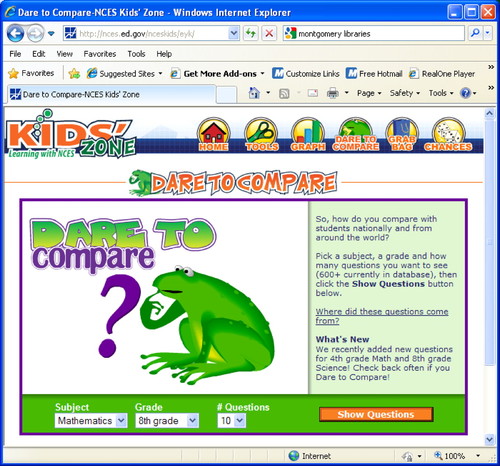
Figure 2. The U.S. Department of Education Kids' Zone website has an excellent interactive graphing feature.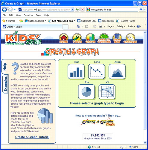
I took an eighth-grade sample math test, and I missed a question that required me to use a box and whisker plot. The box and whisker plot is in my son's eighth-grade curriculum but was not in mine because it was invented by John Tukey in 1977. My ignorance represents the attitude of many biologists toward math and statistics; if our own research or teaching doesn't require us to be conversant in a particular aspect, we ignore it. Fortunately, several sites offered ways for me to quickly learn this statistical representation. In the K–12 arena, Shodor, a nonprofit organization devoted to improving math and science education through simulation technology, has a wide variety of excellent math resources. Its “Interactivate” section is a great place to browse for interactive math learning tools (www.shodor.org/interactivate; Figure 3) and includes a box-plotting tool (www.shodor.org/interactivate/activities/BoxPlot) that allows you to enter data and generate box plots with various characteristics. Shodor provides several sample data sets to get you started, such as car mileage and ACT scores. Specific tabs provide support for learners and instructors. I also liked the box plot posting by Fabian Dill on The Information and Visualization blog (http://informationandvisualization.de/blog/box-plot). Dill starts out with a good straightforward description of the box plot and then gets into some interesting examples and elaborations. Others might prefer the very clear and concise presentation on the Saint John's University website that also has a place for entering data sets into a box-plotting utility (www.physics.csbsju.edu/stats/box2.html). An interesting blog called Junk Chart, by charting maven Kaiser Fung, has a nice treatment of the box plot, including how effective these plots are for looking at the performance of S&P 500 stocks (http://junkcharts.typepad.com/junk_charts/boxplot). The box and whisker plot is particularly good at capturing the overall distribution of a data set and clearly showing outlier and potential outlier values.
Figure 3. Shodor has an “interactivate” section on its website devoted to interactive simulations for supporting math learning.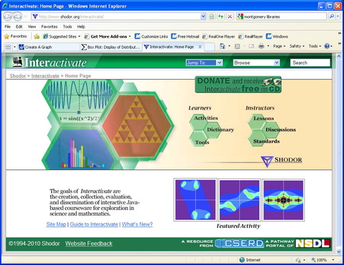
Have I already spent too much time in a Junior High School mathematical backwater? Tukey did a lot more than just invent the box plot. His text Exploratory Data Analysis (EDA; Tukey, 1977) is full of ideas and inventions in addition to the box plot. Tukey is credited with revolutionizing statistical approaches to data and their graphical representations. Today, EDA isn't just an abbreviation for Tukey's book but shorthand for an important approach to data analysis. EDA is used extensively in DNA microarray experiments for example. EDA emphasizes generating hypotheses by looking at lots of data in many different ways, as opposed to more “traditional” statistical approaches for testing null hypotheses. The traditional and EDA approaches are complementary and not in opposition. The EDA approach fits particularly well with the massive data sets that are becoming more common with the growing prevalence of various high-throughput methods.
Microarrays have been an exciting research tool for two decades, but what I find so compelling about microarray experiments in the educational context is the broad range of topics and mathematical complexity that microarray experiments generate. The data raise issues such as raw numerical values (signal magnitude), simple ratios for comparing signals, standard data normalization and log transformations, and a large variety of data-sorting methods and algorithms. Malcolm Campbell (coincidentally the editor for this feature) has been a leading proponent of using DNA microarrays for undergraduate education. He cofounded the Genome Consortium for Active Teaching (GCAT; www.bio.davidson.edu/projects/gcat/gcat.html). It's hard to do justice to the many accomplishments and activities of GCAT in this short review (see Campbell et al., 2007). You can learn a lot about DNA microarrays by visiting the GCAT website, including a section on Laurie Heyer's MAGIC Tool custom software for data analysis, codeveloped with students (www.bio.davidson.edu/projects/MAGIC/MAGIC.html).
The GCAT pages are full of useful information, but they are not what a media critic would call slick. Fortunately, Malcolm teamed up with collaborators at the University of North Carolina several years ago to develop a “MediaBook” on DNA microarrays that is slick enough to have won a Pirelli Prize in 2004 (http://gcat.davidson.edu/Pirelli/index.htm; Figure 4). The section on Data Interpretation covers every major aspect of analyzing array data, from creating heat map images to log transformation and hierarchical clustering of results. The entire MediaBook is beautifully done, with a very attractive design; superior explanatory graphics; and well written, if stiffly read, narration. If you are looking for a single place to start students on an exploration of DNA microarrays, look no further. The MediaBook includes interactive quizzes as well. But, of course, if you want to really engage students in the science of microarrays, you need to join GCAT and have your students do real experiments. For a taste of what it's like to work with array data without generating your own, you might visit the University of Barcelona website that presents a lab practical on analyzing microarray data (www.ub.es/stat/docencia/bioinformatica/microarrays/ADM/practicalMeV.htm).
Figure 4. The Microarrays MediaBook is the best place on the Web for students to get an introduction to the data analysis methods used to interpret DNA microarray experiments.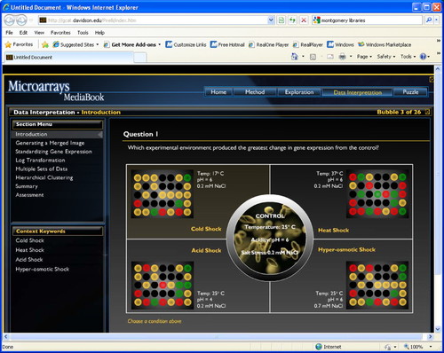
It's appropriate that the MediaBook, as an educational tool, very effectively uses graphics to teach about DNA microarrays, because today's state-of-the-art data analysis tools feature powerful graphics capabilities as well. One of the most popular tools for microarray experiments as well as other large data sets is R, an open-access statistical software package (www.r-project.org; Figure 5). The R project provides users with a complete package of computing environment, language, and graphing tools in a suite that is flexible enough to serve the needs of diverse researchers. R is not as easy to learn as standard desktop software, but a variety of tutorials are available to help (e.g., see http://mercury.bio.uaf.edu/mercury/R/R.html). By the way, although the MediaBook does not feature any box plots, the modest graphing method is extensively used in DNA microarray experiments for early quality-control stages of data processing. The box plot is particularly useful for comparing replicate data sets, and for identifying outliers, which can be associated with key findings or the result of experimental errors. Raphael Gottardos' presentations at the 2008 Canadian Bioinformatics Workshops provide a good overview of the EDA approach and the use of R (www.bioinformatics.ca/workshops/2008/course-content). Scroll down to Essential Statistics in Biology and look at Module 1 as a PDF or PowerPoint file. Gottardos' lab at The Clinical Research Institute of Montreal and the University of British Columbia focuses on computational biology, especially for high-throughput genomic analysis (www.rglab.org).
Figure 5. The R Project for Statistical Computing is an open source package for data analysis and a favorite of EDA aficionados.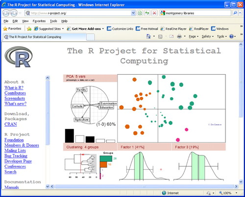
There are at least two other important software packages that should be mentioned in connection with data analysis, MATLAB and Mathematica. MATLAB is a product of The MathWorks (Natick, MA) and enjoys wide use in academic and industrial research settings (www.mathworks.com/products/matlab). MATLAB began as a numerical computing language but has grown to include symbolic computing capabilities and more sophisticated graphing features. Mathematica is the mainline product of Wolfram Research (Champaign, IL), founded by physicist, mathematician, entrepreneur, and computational guru Stephen Wolfram. The best portal into the Wolfram world provides a list and description of his many different websites (www.wolfram.com/webresources.html). Wolfram declares that his various insights into computing forced him to invent, not a new science, but “a new kind of science,” the title of his book and a website (www.wolframscience.com). The central tenant of Wolfram's science is that natural laws are digital, and very simple programming rules are the basis for complex natural systems. He is particularly fond of showing simple “cellular automata” programs that illustrate the complex patterns that can arise from many iterations of a simple set of interactions. You can get a taste of his style and ideas by viewing his 20-minute talk on the TED website (www.ted.com/talks/lang/eng/stephen_wolfram_computing_a_theory_of_everything.html). A hallmark of Wolfram Research products is outstanding graphic capabilities, and the demonstrations website is the best place to get a sample (http://demonstrations.wolfram.com). For example, search for “turbulence,” an important factor in many real biological systems, and you will find 13 interesting demonstrations. To use the interactive demonstrations, you will have to download the free Mathematica Player. Wolfram calls his latest project WolframAlpha and describes it as an attempt to make all knowledge computable (www.wolframalpha.com). I think of WolframAlpha as “Ask Jeeves” (www.ask.com), where Jeeves is a robot butler who always answers your questions with data instead of sentences. Interestingly, when I tried to use either Jeeves or WolframAlpha to find out how many offshore oil rigs there are in the world, neither site gave me any useful information, whereas Google gave me some very quick leads. WolframAlpha seems like an interesting idea and produces some thought-provoking results when you try the examples they suggest, such as entering your birthday.
I have been emphasizing graphical representations of data, in particular for exploring the data as opposed to testing hypotheses. Mark Twain warned us about “lies, damn lies, and statistics,” and that was before intoxicating computer graphics were added to the mix. Good visuals can be very persuasive, and Hans Rosling has taken his interest in data and statistics in a provocative direction. Wolfram has a TED video, but Rosling has at least five TED videos. His TED talk on human immunodeficiency virus is only 10 minutes and gives you a good idea about how his Gapminder graphing tool works (www.ted.com/talks/lang/eng/hans_rosling_the_truth_about_hiv.html; Figure 6). To play with Gapminder directly, visit www.gapminder.org. Rosling does not ask questions about the data per se but is interested in graphing data sets concerning health, economy, and demographics to look at global issues in ways that provoke critical thinking and challenge conventional wisdom. In a way, he's taking a looser approach to EDA, where he looks for correlations between health data and economic data. There's no doubt that viewing data this way can make a powerful impression and can provoke critical thinking. The risk, of course, is in confusing correlation and causation. I think it could be interesting to have students grapple with some of the issues provoked by Rosling's visualizations. You could start by playing with the data and tools called “Gapminder World,” but it's probably best to visit one of the “labs” and view some of the animated charts to see how the method works. Gapminder makes the data it uses directly available on the website, and there is also a section devoted to teachers.
Figure 6. Gapminder is a website and visualization by Hans Rosling for illustrating aspects of various global health and economics issues.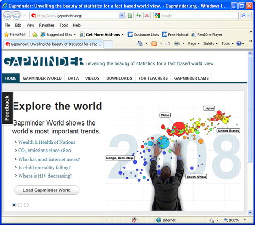
I think we can all agree that nothing beats having students grapple with actual data, and struggle to draw meaningful ideas and conclusions from those data. I'd like to close with a short list of some sites that provide access to a variety of data sets worthy of analysis.
Exploring Data from Education Queensland, Australia (http://exploringdata.net/) is an excellent website for introductory statistics and includes a large collection of data sets at http://exploringdata.net/datasets.htm#coedine.
Head Start is the once universally hailed early reading program for young children. More recently, enthusiasm for Head Start has been less than unanimous primarily due to controversy over attempts to measure the program's impact. Some of the assessment data are available for you to analyze and draw your own conclusions (www.acf.hhs.gov/programs/opre/hs/impact_study).
Doug Tallamy is an entomologist at the University of Delaware and the best-selling author of Bringing Nature Home: A Case for Native Gardening (2007, Timber Press; http://bringingnaturehome.net). Part of his argument for restoring landscapes with native plants is that they support more biodiversity. Tallamy has published species lists to support his hypothesis. A “Guide to Lepidoptera on Ornamentals,” is a downloadable list of plant and insect species (http://copland.udel.edu/∼dtallamy/host/index.html).
The Math Forum at Drexel University has a list of websites that have publicly accessible data sets (http://mathforum.org/library/topics/data_sets), including websites and data sets aimed more at the K–12 level (http://mathforum.org/workshops/usi/dataproject/usi.genwebsites.html).
The Quantitative Environmental Learning Project from Seattle Central Community College has a wealth of data sets available to support teaching math in the context of environmental science (www.seattlecentral.edu/qelp).
Vanderbilt University Department of Biostatistics makes dozens of mostly medically relevant data sets available in a variety of formats (http://biostat.mc.vanderbilt.edu/twiki/bin/view/Main/DataSets?CGISESSID=10713f6d891653ddcbb7ddbdd9cffb79).
ACKNOWLEDGMENTS
I thank Malcolm Campbell for helpful suggestions and edits to this manuscript.


