The Synthesis Map Is a Multidimensional Educational Tool That Provides Insight into Students’ Mental Models and Promotes Students’ Synthetic Knowledge Generation
Abstract
Concept mapping was developed as a method of displaying and organizing hierarchical knowledge structures. Using the new, multidimensional presentation software Prezi, we have developed a new teaching technique designed to engage higher-level skills in the cognitive domain. This tool, synthesis mapping, is a natural evolution of concept mapping, which utilizes embedding to layer information within concepts. Prezi’s zooming user interface lets the author of the presentation use both depth as well as distance to show connections between data, ideas, and concepts. Students in the class Biology of Cancer created synthesis maps to illustrate their knowledge of tumorigenesis. Students used multiple organizational schemes to build their maps. We present an analysis of student work, placing special emphasis on organization within student maps and how the organization of knowledge structures in student maps can reveal strengths and weaknesses in student understanding or instruction. We also provide a discussion of best practices for instructors who would like to implement synthesis mapping in their classrooms.
INTRODUCTION
Experts within a field have rich, well-connected knowledge structures that allow them to rapidly retrieve information and see unexpected connections and patterns. On the other hand, novices to a field have not yet formed these well-connected knowledge structures and therefore may see information as a series of disconnected facts or as groups of facts within disconnected silos. According to the key work How People Learn, “to develop competence in an area of inquiry, students must: (a) have a deep foundation of factual knowledge, (b) understand facts and ideas in the context of a conceptual framework, and (c) organize knowledge in ways that facilitate retrieval and application” (National Research Council [NRC], 2000, p. 16). Thus, a focus of many college courses is students’ development of an organizing framework to help them establish a sustained understanding of the subject under study (Khodor et al., 2004).
When teaching an upper-level undergraduate course, Biology of Cancer, one of the authors (C.J.B.) had noted students’ difficulty with developing this type of organizational framework. We therefore created an assignment type, termed the synthesis map, as a tool to help students within this course develop an explicitly defined organizational framework to describe their understanding of carcinogenesis. Specifically, students were asked to construct a visual representation of their model of carcinogenesis using a cloud-based presentation tool that allows representation in multiple dimensions. The students’ model was developed over the course of a semester; students adapted their maps in response to their growing knowledge base and formative feedback from the instructor and peers.
The synthesis map assignment may be considered an evolution of the concept map. The concept map as a student learning tool was developed in the 1970s by J. D. Novak and is based on the cognitive learning theory of David Ausubel, which stressed meaningful learning (Ausubel, 1962). The purpose of using concept maps as a student assignment in classroom learning is to have students explicitly establish a personalized, hierarchical organization of their understanding of a certain subject or concept. As a student learning strategy, an instructional tool, and a means for both formative and summative assessment of student understanding, this tool has improved science education (Novak, 1990). Successfully implemented concept map assignments inspire student metacognition by encouraging students to examine their own knowledge structures, and repeated use of concept maps can reveal how these knowledge structures change over time (Novak and Gowin, 1984). Concept mapping as an iterative exercise challenges students to organize their knowledge, analyze the validity and efficacy of that organization, and even produce novel or modified knowledge structures. It is a tool that engages the higher levels of Bloom’s taxonomy in the cognitive domain (Peresich et al., 1990; Anderson and Krathwohl, 2001). It has also been shown to stimulate positive learning behaviors in the affective domain, such as students’ ability and willingness to receive and respond to information (Krathwohl et al., 1964; Maas and Leauby, 2005). This increase in positive affective-domain behaviors not only encourages meaningful learning but also significantly reduces student anxiety about learning the biological sciences (Jegede et al., 1990).
As Internet use became more popular and accessible in the 1990s, software facilitating concept map creation became more readily available. One example of such software is the freely downloadable CmapTools software developed by the Institute for Human and Machine Cognition. This and other software have enhanced students’ ability to construct concept maps. In general, advances in technology allow for large advances to be made in how education tools are implemented, and in 2003, J. D. Novak commented that “we need to expand our efforts to disseminate the new educational ideas and tools” (Novak, 2003, p. 131). It is with this challenge in mind that we have developed the synthesis map, which we believe to be a natural evolution of the concept map.
Like a concept map, a synthesis map is a visual representation of a student’s understanding and knowledge structures, and it is capable of highlighting the connectivity (or lack thereof) between concepts in the student’s knowledge base. However, two-dimensional concept maps are limited in scale by how much information can fit on a single paper or screen. Synthesis maps work around this constraint by utilizing a third dimension of depth to embed layers of information within concepts. However, a synthesis map is not simply a set of layered concept maps. Ideally, a synthesis map can be used to show hierarchical knowledge structures in the same presentation as temporally arranged process diagrams and spatially represented physical structures pertinent to the subject of interest. When used appropriately, a synthesis map can simultaneously present a detailed model of a student’s understanding of several broad subjects, illustrate the connectivity of these subjects, and delve deeply into the minute details of each subject. We have developed the synthesis map exercise specifically to target the higher levels of Bloom’s taxonomy in the following ways: the assignment necessitates that the student analyze and categorize information, each student must construct and develop his/her own unique knowledge structure, and each student is required to evaluate and summarize research regarding his/her subject to provide evidentiary support for the model he/she has constructed.
In implementing this new type of learning and assessment tool, we used the currently available, free to use presentation software Prezi. Prezi is a cloud-based presentation tool that allows for seamless horizontal transitions, and it combines this utility with a zooming user interface (ZUI) that lets the author of the presentation use both depth and distance to show connections between data, ideas, and concepts (Conboy et al., 2012). Users can import images into the Prezi interface as well as create their own images and organizational structures and icons. It is possible to use Prezi to construct traditional concept maps without depth or to create a linear presentation similar to a PowerPoint presentation. Prezi, however, also allows the user to create multiple, hierarchical knowledge structures in the same presentation and provides the option of exploring these structures in a unique, nonlinear path (Rockinson-Szapkiw et al., 2011).
We have used the synthesis map assessment tool in the context of a biological sciences course covering the biology of cancer. This class is designed to provide an introduction to the underlying principles of cancer development emerging from the vast and growing collection of facts about this disease. The synthesis map has particular utility in biological science courses due to the high degree of connectivity present between biological concepts, the large range in physical scale in biological organisms (from single atoms to whole populations), and the great range of conceptual depth associated with biological knowledge (Smith et al., 2013). It is within the context of the range of scale and depth inherent in the biological sciences that Prezi’s ZUI can demonstrate its utility. Students in this class constructed synthesis maps as visual representations of their model of carcinogenesis. One of the challenges in understanding a complex process like carcinogenesis is fitting the different components into a coherent whole. By constructing visual representations of their model (which, by definition, changes in response to new knowledge), the students clarified and structured their growing understanding of carcinogenesis.
In this study, we examined the features of the synthesis maps students produced in this course, asking the following questions:
What descriptive statistics do we observe for the maps produced in this course? Was any dimension of these descriptive statistics predictive of a more effective synthesis map?
What organizational strategies did students use? Were these organizational strategies equally effective?
Did elements of the synthesis map construction predict success on other, more traditional measures of student learning?
This study, therefore, falls within the “what is” category of the taxonomy of scholarship of teaching and learning studies seeking to describe constituent features of the synthesis map learning tool (Hutchings, 2000).
In this paper, we describe our observations of student organizational strategies used to create the synthesis maps and of how students’ organizational constructs can reveal the nuances of their understanding (or lack of understanding) of the subject. We also scored the maps based on four criteria (organization between categories, organization within categories, accuracy, and completeness) and present those scores. Quantitative, correlative analysis shows that elements of students’ organization of the synthesis map interacts with other class metrics, suggesting a potential tool for revealing student understanding that is particularly important for success within a course.
One area in which more development is needed in educational research is recommendations for the practical application of concept mapping as an assessment method (Ruiz-Primo and Shavelson, 1996). To that end, we have included a set of best practices developed during retrospective analysis of the synthesis map assignment. It is our hope that this paper will provide a clear guide for other life sciences educators to utilize the synthesis map technique we have developed, leveraging current technology to enhance and evolve a well-established teaching tool.
METHODS
Recruitment of Students into the Study
The study was carried out in a biological sciences course at Vanderbilt University, a midsized, highly selective, private, research-intensive university in the southeastern United States. The course, which focused on the biology of cancer, is an elective course aimed at junior and senior undergraduates from a mix of science and engineering majors. Investigator C.J.B. was the instructor for the course. Students completed the synthesis map assignment as part of their normal course work. After completion of the course, students received two letters: one letter asking for permission to use their class data in the study and a second letter asking for permission to use images from their map as examples in the manuscript reporting study results. Copies of the letters are included in the Supplemental Materials (pp. 1–2). The study was carried out under the approval of the Vanderbilt Institutional Review Board. Out of 27 students, 24 agreed to participate in the study.
Introduction and Commencement of the Synthesis Map Assignment
The synthesis map project was introduced on the first day of class when reviewing the syllabus (see the Supplemental Material, pp. 3–8), which provided a brief description of the goal and format of the project. During the third week of class, the project was reviewed, and one class day was spent taking the first steps. Specifically, students self-assembled into groups of three and drafted their first synthesis map on paper based on the following prompt:
Work with two colleagues to draft your first synthesis map (20 Minutes).
First, compare your lists of things you know about cancer development. Discuss until you can come to a common list. If there is strong disagreement, then the lists for the three people don’t have to be identical.
Second, think about how you would represent these ideas visually. Sketch out at least one possible visual representation that incorporates all the things you know. It can include symbols, real images, labels, videos, etc. You can think in terms of scale, zooming in and out.
The instructor then introduced the Prezi tool and led the class as a whole through the initial steps of creating a Prezi, with individual students creating their new Prezis on their own laptops. Students were encouraged to collaborate with the two members in their individual groups when designing their synthesis maps but were required to independently create their own presentations. In creating the maps, students used the course textbook as a major, but not exclusive, source of images to incorporate into their maps (Weinberg, 2007). Because the images were used for educational purposes, were confined to use by class members, and were not made freely available, this use falls within fair use of materials (see, e.g., the description provided here: www.copyright.com/Services/copyrightoncampus/basics/fairuse_list.html).
After the initial submission, each student received formative feedback from the instructor and from the two peers within his/her group. The groups remained constant throughout the semester. Students submitted their synthesis maps three more times during the semester, revising and expanding them as their knowledge grew. They received formative feedback from the instructor and two peers each time, with the feedback consisting of written comments identifying strengths and weaknesses in organization, clarity, accuracy, and completeness. Before the final submission, no grades were assigned. The midsemester submissions were important to the final grade, however, as each submission earned the student the “right” to 20% of the final grade; that is, a student who missed a midsemester submission could earn a maximum of 60/75 on the final synthesis map.
Grading
Student synthesis maps were initially graded by the course instructor (C.J.B.), using the grading rubric provided in the Supplemental Material (p. 9); the rubric was developed in collaboration with the students in the class and consisted of a total of 75 points. After completion of the course, the maps created by students consenting to be a part of this study were analyzed separately by both authors using an adapted form of the rubric used during the course. The maps were assessed based on the organization presented between major concepts associated with tumorigenesis, the organization within these major concepts, the accuracy of the information presented, and the completeness of the map. Each of these components was assigned a score from 0 to 10, with 10 being the best possible score. The total score for each map was the combined scores of these four components for a total of 40 possible points. The total number of slides the students used for each map were also counted, and the maximum level of embedding for each map was determined. Once individual scores were assigned, a consensus score for each category of each map was determined during analysis of each map.
Qualitative Analysis of Synthesis Maps
To explore the choices made by the students in constructing their synthesis maps, we analyzed the characteristics of their maps. We asked two questions about each map: “What organizational strategies did the student use?” and “What organizational strengths and weaknesses did we observe?” To address these questions, we used a modified grounded-theory approach (Strauss and Corbin, 1990). The authors briefly reviewed all of the maps together, identifying potential themes. Each author then independently reviewed the maps for answers to these questions, categorized the responses, and then examined the categories to identify themes. We then compared our analyses, in most cases reconciling discrepancies to arrive at a single interpretation.
Statistical Analysis of Quantitative Data
The quantitative student data from the synthesis maps described above were collected, as were data regarding students’ exam grades, final paper grades, and final class grades. These quantitative components were analyzed for correlations by determining the Pearson’s product-moment correlation statistic and calculating the p value associated with significance tests for these correlations. Correlation tests resulting in a Pearson’s statistic of |1–0.7| were considered to have strong correlation, values of |0.69–0.4| were considered to indicate moderate correlation, values of |0.39–0.1| were considered to indicate weak correlation, and values less than |0.1| were considered to indicate no correlation. Correlations analyzed by regression analysis were done with a simple liner regression model created using the ordinary least-squares method. The linear regressions are displayed in the standard form for a linear equation: y = mx + b. p Values were calculated for each regression line. p Values < 0.05 indicate that the predictor variable significantly explains some portion of the variation in the response variable. This portion is indicated by the R2 value.
RESULTS
Qualitative Description: Synthesis Map Organizational Strategies
We examined the final synthesis maps for 24 students from a class of 27; the remaining three students either did not respond to requests for permission to examine the maps or had deleted the maps from their accounts. All of the synthesis maps represented seven major components of cancer development addressed in the course, although the depth and style of this representation varied: the progressive nature of carcinogenesis, the role of accumulating mutations and genetic rearrangements, proto-oncogenes, tumor suppressor genes, immortalization, interactions with noncancerous cells, and metastasis. All of the maps we examined were multilayered, with all students using the zooming feature of Prezi to embed information within larger concepts; the degree of layering varied from two layers to five layers. In addition, students uniformly created paths through their maps, allowing viewers to click through steps to track through the map. The lengths of these path varied, ranging from 56 to 141 “frames,” and students typically used arrows and guiding text to help viewers understand the organization. In some cases, the students created paths that encompassed all features of the map, while other students included additional features that could be explored independently of the planned pathway.
Students used three major organizational strategies when creating their maps: conceptual, spatial, and narrative:
Students using conceptual organization identified particular features of cancer development, such as the components listed above or the hallmarks of cancer identified by Robert Weinberg (Hanahan and Weinberg, 2000), and used each of these as a node in their maps, describing each feature relatively independently of the others. In essence, maps using this organizational strategy resembled a collection of concept maps or a visual depiction of an outline. Figure 1 displays a screenshot of a synthesis map that relied primarily on conceptual organization.
Students using spatial organization created structures that were explicitly meant to represent physical components associated with a given concept. For example, students using this organizational strategy often created images of normal and cancerous cells and embedded features that differed between them, such as specific mutation repair systems or cell surface receptors. Figure 2 displays screenshots of a synthesis map that relied primarily on spatial organization.
Students using a narrative organization used the Prezi tool to tell a story of the phenomenon being mapped. Generally, students would illustrate events of tumorigenesis in the order in which they tend to occur and would integrate major concepts along a timeline. Figure 3 displays a screenshot of a synthesis map that relied heavily on narrative organization.
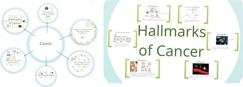
Figure 1. Screenshots showing an overview of a map that primarily used conceptual organization. (A) Several concepts relevant to tumorigenesis are arranged around cancer as the central, anchoring concept. (B) A zoomed-in view of one of the subconcepts shows a conceptual arrangement of the “hallmarks of cancer” as conceptually connected to the broader concept “cancer.” Embedded within this conceptual arrangement are illustrative examples of the different hallmarks. The map can be explored by following this link: http://prezi.com/hr4u6kkhah2n/cancer-bio-synthesis-map/?utm_campaign=share&utm_medium=copy. Sources for images used within the map are provided in the Supplemental Material.
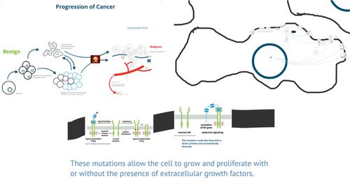
Figure 2. (A) Screenshot showing an overview of a synthesis map that used primarily spatial organization; you can explore the map and follow the author’s suggested path by following this link: http://prezi.com/tp6jcnrnlh3a/synthesis-map-complete-version/?utm_campaign=share&utm_medium=copy. (B) A closer view of frame 9 of the map, which illustrates finer details of the spatial organization of information. The student has created a representation of a cell and its nucleus. (C) Frame 31 of the same synthesis map shows a representative image of how some students incorporated images of transmembrane receptors at the cell surface into their spatial model of a tumor cell. Sources for images used within the map are provided in the Supplemental Material.
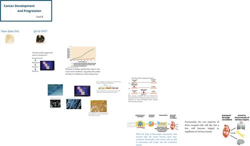
Figure 3. Screenshot of a synthesis map that primarily used narrative organization; you can explore the map and follow the author’s suggested path by following this link: http://prezi.com/fvvz5fpjzj_1/synthesis-map-3-and-4/?utm_campaign=share&utm_medium=copy. Sources for images used within the map are provided in the Supplemental Material.
Although students tended to adopt one of these schemes as their primary organizational strategy, most used elements of the other organizational schemes as needed (Figure 4). For example, the synthesis map shown in Figure 3 primarily used a narrative organizational scheme but incorporated some conceptual organization (frames 24–35 within that map). All three organizational strategies allowed for effective embedding.
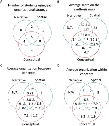
Figure 4. Venn diagrams describing the distribution of organizational strategies used on students’ synthesis maps and matching organizational strategies to average values for map scores. (A) The number of students utilizing each organizational strategy alone or in combination. (B) The average score on the synthesis map (out of 40) for each organizational scheme (± σ). (C) The average score for organization between major concepts on the synthesis map (out of 10) for each organizational scheme. (D) The average score for organization within individual concepts on the synthesis map (out of 10) for each organizational scheme.
We asked whether a particular organizational strategy (conceptual, spatial, or narrative) or combination of strategies was more effective than other combinations. The Venn diagrams in Figure 4 show that a majority of students used some form of conceptual organization in their synthesis maps. Synthesis maps utilizing only spatial or narrative arrangement alone or in combination were less popular options, but a breakdown of synthesis map scores and scores for organization indicates that all organizational schemes were conducive to successful synthesis map creation. All three primary strategies and their combinations appeared to allow effective map organization, although a purely conceptual organization—akin to a visual outline—appeared to be slightly less effective at conveying relationships between concepts.
We found that the maps offered insight into how students conceptualized relationships between big components of cancer development. For example, the map shown in Figure 1 uses different circles on the map to describe components of cancer development. The author does not make relationships between these components explicit; implicit links are apparent to a knowledgeable, careful viewer who notes example proteins that appear in two or more circles, but the author does not make these links explicit for the viewer. The author did, however, select many images from sources besides the textbook (∼40% of the total), including many that were not used in class materials. Furthermore, these images typically conveyed rich meaning within the map. Thus, the decision of this student to find images beyond those used in the class to illustrate a conceptualization of cancer suggests a well-developed knowledge structure, in spite of the lack of explicit connections between concepts.
The map shown in Figure 2 shows a highly integrated knowledge structure around carcinoma cell–stromal (“heterotypic”) interactions, angiogenesis, and metastasis, with the spatial organization of map facilitating a concise and highly visual integration of the topics. The map shown in Figure 3 displays still another mechanism for relating components of cancer, using questions or short statements, often narrated via the Reveal function in Prezi, to draw explicit relationships between topics (see frames 35, 66, 82–83, and 92–94 for examples). The connections that are missing or unclear can also be informative. For example, the map shown in Figure 3 includes p53 and Rb as examples of tumor suppressor proteins but does not link inactivation of these proteins to cell immortalization through escape of senescence. This absence may reveal mental “siloing” of information rather than a fully integrated understanding of these related topics.
Other examples revealed larger difficulties with organizing information. One map we investigated exhibited several completely unconnected nodes within the map. Within several of these nodes, there were large blocks of very detailed text and multiple images supporting the text. Each node, however, would be incomplete and unconnected from other nodes. The overall appearance of the map was disorganized and scattered. Taken together, these observations suggested the student was having difficulty fitting detailed information into a large, integrated framework. In other words, the student appeared to get lost in the details of a particular node, then jump out, begin another node, and repeat the process.
The maps also provided insight into students’ incorporation of evidence into their personally synthesized knowledge structures. For example, the map shown in Figure 3 repeatedly incorporates evidence into the section on cancer progression (see, e.g., frames 13, 14, 16–22). None of the maps examined, however, incorporated significant evidence into the sections on proto-oncogenes and tumor suppressor genes, suggesting a possible deficit in instructional materials.
Quantitative Analysis
Effective Synthesis Map Features.
Each synthesis map was scored for organization (both between concepts and within concepts), accuracy, and completeness using the rubric described in the Supplemental Material. Overall, student maps were very accurate, complete, and well organized (Table 1). The average score on the project was 84%, with one student earning a perfect score. The distribution of student scores shown in a histogram (Figure 5) visually approximates a normal distribution centered around a “B+” or “A−” grade. Multiple students achieved perfect scores on individual metrics. Of the quantitatively assessed metrics, map accuracy had the highest average score and the smallest deviation.
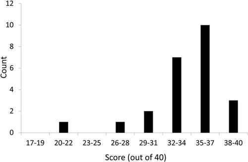
Figure 5. Histogram of student scores on synthesis map assignment (out of 40 possible points).
| Mean | SD | Range | |
|---|---|---|---|
| Organization between major concepts | 8.16 out of 10 | 0.30 | 4–10 |
| Organization within major concepts | 8 out of 10 | 0.29 | 4–10 |
| Completeness | 8.33 out of 10 | 0.23 | 6–10 |
| Accuracy | 9.21 out of 10 | 0.19 | 7–10 |
| Total score | 33.7 out of 40 | 3.86 | 21–40 |
| Maximum levels of embedding | 3.33 | 0.16 | 2–5 |
| Number of slides in presentation | 98 | 4.8 | 56–141 |
Although some students only minimally utilized the embedding feature of the Prezi software, every student created embedded information in his/her map to some extent using the ZUI, with most students implementing more than two levels of depth to indicate that a certain piece of information or a concept belonged in a hierarchical subset of the one above it. The largest range in any given metric was in the number of slides used to fabricate each student’s map.
The set of scores given in each metric described above were compared with one another to determine whether there were correlations between different metrics making up the synthesis map assignment. The Pearson product-moment correlation statistics were calculated to determine correlation between the different data sets (Table 2), and correlations were checked for significance by calculating the p value for each correlation (Table 3). For the Pearson statistic, a p value < 0.05 means that we can reject the hypothesis that the correlation is due to random sampling, indicating that the correlation is significant.
| Organization between concepts | Organization within concepts | Completeness | Accuracy | Levels of embedding | Number of slides | Total score | |
|---|---|---|---|---|---|---|---|
| Organization between concepts | 1 | ||||||
| Organization within concepts | 0.58 | 1 | |||||
| Completeness | 0.20 | 0.43 | 1 | ||||
| Accuracy | 0.54 | 0.69 | 0.61 | 1 | |||
| Levels of embedding | 0.26 | 0.59 | 0.37 | 0.51 | 1 | ||
| Number of slides | 0.06 | 0.08 | 0.54 | 0.03 | 0.30 | 1 | |
| Total score | 0.79 | 0.88 | 0.61 | 0.80 | 0.55 | 0.21 | 1 |
| Organization between concepts | Organization within concepts | Completeness | Accuracy | Levels of embedding | Number of slides | Total score | |
|---|---|---|---|---|---|---|---|
| Organization between concepts | |||||||
| Organization within concepts | 0.071 | ||||||
| Completeness | 0.89 | 0.21 | |||||
| Accuracy | 0.083 | 0.001 | 0.26 | ||||
| Levels of embedding | 0.15 | 0.005 | 0.16 | 0.01 | |||
| Number of slides | 0.67 | 0.80 | 0.002 | 0.93 | 0.17 | ||
| Total score | 0.008 | 1.5 × 10⁻⁶ | 0.01 | 3 × 10⁻⁶ | 4.3 × 10⁻⁴ | 0.17 |
The correlations between different components of the synthesis map reveal important information about the learning tool, not only with the components that are significantly correlated but also with the components that are not significantly correlated. For example, it is expected that the two organization categories, as well as completeness and accuracy would correlate moderately or strongly with the total score, because the sum of the score from these components makes up the total score. However, the maximum levels of embedding used in the map is significantly, moderately correlated with the total score (p = 4.3 × 10⁻⁴), indicating that, even though this component did not numerically contribute to the total grade, it did contribute in other, less obvious ways. Antithetically, the total number of slides used in each presentation did not significantly correlate to the total score. In fact, the only significant correlation for the number of slides used is a moderate correlation with completeness, indicating that, while the number of slides does not have a strong effect on organization or accuracy, it does have an effect on the completeness or perceived completeness of the map. Going further, it implies that there is a minimum number of slides that must be used to incorporate all of the necessary information for this specific assignment.
The synthesis map assignment is designed to provide insight into students’ knowledge structures, so the organization of the maps is of particular interest. The scores for organization between major concepts do not significantly correlate with the scores for organization within individual topics covered by the maps, but the p value (p = 0.071) is close enough to significant to indicate that a larger sample size may be needed to show true significance. However, the organizational strategies and goals for these two categories are not necessarily similar. This is evidenced by the fact that one of the measurable metrics of organization, the amount of embedding used in the map, correlates significantly with the student scores for organization within concepts but does not correlate with organization between concepts. By its very nature, this capability of the Prezi software lends itself to increasing the amount of fine detail and showing the underlying organizational structure within the structure in which the data or concepts are embedded. It is also interesting to note that the level of embedding has a significant moderate correlation with map accuracy, indicating that one component of accuracy may be the way that the fine detail of the knowledge structure is arranged. Certainly, a clearly, deeply organized map presents a greater appearance of accuracy than a cluttered or shallow map.
Correlation with Other Class Metrics.
To determine whether any element of the synthesis map could provide particular value for promoting student success, we analyzed the map scores and the components of the map scores against other metrics of class success: combined exam scores, final paper scores, and class grade without the synthesis map included. Table 4 shows data extracted from correlation tests between components of the synthesis map and other class metrics. Notably, we observed a significant, moderate correlation between students’ ability to illustrate organization between concepts and their performance on course exams and in the final course grade (Table 4, rows 1 and 4).
| Correlated data | Correlation statistic (r) | p Value |
|---|---|---|
| Class score without map vs. organization between concepts | 0.43 | 0.035 |
| Class score without map vs. accuracy on map | 0.44 | 0.032 |
| Class score without map vs. organization within concepts | 0.11 | 0.61 |
| Total exam score vs. organization between concepts | 0.58 | 0.003 |
| Total exam score vs. organization within concepts | 0.23 | 0.23 |
| Total exam score vs. synthesis map score | 0.44 | 0.032 |
| Final paper grade vs. synthesis map score | 0.05 | 0.83 |
| Final paper grade vs. organization between concepts | 0.06 | 0.78 |
Linear regressions were performed following correlative analysis of student data to determine whether certain components of the synthesis map could act as linear predictor variables for other measurements of success in the course. The organization between major concepts in the map is of particular interest, because it has significant correlation with class score and total exam score. Figure 6 shows linear regressions with organization between major concepts on the synthesis map as the predictor variable for class score and total exam score. The variation in scores for organization between concepts on the synthesis map can account for ∼33% of the variation in combined exam score and 25% of the variation in class grade. This illustrates the power of having students examine and make explicit their knowledge structures. The score for organization between concepts makes up a small portion of the final grade for the synthesis map, which is itself only 14% of the course grade. Yet this metric can account for a large portion of the variation in class grade. These results suggest that formative feedback on this element of the synthesis map may have potential larger effects for student performance in a course.
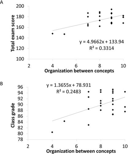
Figure 6. (A) Linear regression analysis of organization between major concepts on the synthesis map as a predictor of total exam score (p = 0.003). (B) Linear regression analysis of organization between major concepts on the synthesis map as a predictor of class grade (p = 0.013).
DISCUSSION
The Organization of Students’ Synthesis Maps Provides Insight into Their Knowledge Structures and Engages Meaningful Student Learning
The way students organize their maps with respect to relationships between the major concepts of tumorigenesis represents their broad understanding of these concepts and their large-scale mental models interconnecting these subjects. The way students organize the data and evidence presented within each major subject or category provides insight into the finer structure of their understanding, as well as how they evaluate and incorporate real data into their personally synthesized knowledge structure. It is the combination of these two organizational metrics that reveals the hierarchical nature of the students’ understanding and shows how they transition from gross- to fine-scale structuring of knowledge regarding the chosen topic.
As with concept maps, the organizational structure of a synthesis map is most important for revealing student misconceptions and problems with instruction. The maps explicitly visualize the students’ strengths and weakness at different organizational scales. For example, some maps had strong large-scale organization between major concepts but had little data, detail, or evidence. This indicated that these students may have had a strong, gestalt view of tumorigenesis but either had not internalized information associated with the fine detail of these concepts or lacked the deep cognitive organizational structure for these concepts. Other maps had a large amount of fine detail within an individual concept but little connectivity or an incomplete final structure. Some maps existed between these extremes, indicating where students’ intermediate understanding or mental organizations might lie. Individual student’s misunderstanding can be diagnosed by using the synthesis map as a formative assessment tool and looking for errors in knowledge structure, errors in content, or omission of content (McClure et al., 1999). Problems with instruction will likely lead to multiple maps displaying the same or similar error(s). Once discovered, errors or omissions in instruction can be corrected in class and/or the syllabus can be adjusted for future classes.
By examining and testing student knowledge structures with synthesis mapping, it is possible to engage students in a different way compared with purely objective assessment methods such as multiple choice and short answer. It is known that concept map scores do not correlate well with multiple-choice scores, indicating that mapping exercises assess different skills, such as higher-level skills in the cognitive domain of Bloom’s taxonomy (Morse and Jutras, 2008). This different method of engagement with course material can have a positive impact on students for whom lecture and text is not the optimum learning path. The relational knowledge created with a synthesis map is something that learners must construct for themselves, and the act of creating relationships between existing knowledge and new knowledge creates meaningful learning (Novak, 2003).
Our observation that students’ ability to illustrate organization between major concepts can predict their success in other measures (i.e., test scores and final grade) corresponds to Bransford and colleagues’ identification of conceptual frameworks as key to learning (NRC, 2000). It may also suggest that helping students develop a broad, well-connected conceptual framework early in the course may improve their overall learning. By explicitly helping students develop such a broad framework before moving to more nuanced, data-driven details, instructors may be able to accelerate their students’ progression toward expert-like knowledge structures. This observation may be particularly relevant in cell and molecular biology courses like the biology of cancer course used as an example here, wherein a highly inductive approach to research may lead to courses that focus on concepts emerging from examples.
Suggested Good Practices for Implementing the Synthesis Map
Teaching requires simultaneous allocation of student and instructor resources toward the pursuit of multiple goals. It must be asked of each new teaching technique: Will it be worth the effort? We have included some suggested best practices for instructors implementing the synthesis map that will increase the efficacy of this teaching tool and reduce wasted effort:
Introduce the Assignment Early in the Semester.
One concern with concept mapping as a teaching tool is that it takes a significant amount of time to teach and implement concept mapping in the classroom, especially with students with no practical exposure to the technique (Maas and Leauby, 2005). Synthesis mapping is inherently more complex than concept mapping, so it requires an even greater time commitment and more practice/procedural instruction.
State Explicitly the Intended Audience.
Synthesis maps could be used for a variety of purposes: to share only with the instructor to reveal knowledge structures, to share with peers within a class to help with studying or to teach individual topics related to larger class themes, to share on the Web for general education purposes, to use in teaching projects with younger students. Each of these possibilities represents a different audience that can be expected to bring different starting knowledge. Being explicit with students about the intended audience will help them consider the background they need to provide and the level of detail that will be appropriate.
Describe Potential Organizational Strategies.
To allow students freedom to develop their own visual models, we intentionally gave very sparse instructions about what the synthesis maps should look like. While this approach was effective for most of the students in the course, it was more comfortable for some students than for others, some of whom vacillated between organizational strategies. Describing potential organizational strategies that others have used, however, may allow some students to intentionally choose the approach that best fits their mental model.
Encourage Students to Make a Sparse Map Early in the Process and Have Them Revise and Iterate.
The most successful students chose an organizational strategy and used it consistently throughout their map. Some students started their map from scratch late in the semester, disregarding their earlier work. These examples generally had a more sophisticated and coherent organization but often lacked completeness. We hypothesize that this was caused by fatigue associated with attempting to complete the entire assignment from scratch late in the semester.
Have the Students Work in Groups to Provide Peer Feedback and Affective Support.
Students working on concept maps in teams have been shown to be more successful on the assignment (Morse and Jutras, 2008). With the synthesis map assignment, we also saw instances of convergent design in many groups. In these groups, students can learn from one another and receive regular peer feedback. We hypothesize that this feedback provides positive affective support to students and increases problem-solving performance and success on the assignment. One negative effect of small groups that must be acknowledged is the possibility that convergent design could potentially mask students’ personal understanding or force them to adopt another student’s organization.
Allow Multiple Instances for Feedback for the Students, Which Can Come from Other Members of Their Small Groups and from More Formalized Instructor Feedback during the Semester.
The fundamental process of concept mapping is not necessarily iterative; formative assessment using concept maps can take just minutes of class time. Owing to the increased complexity inherent in creating a synthesis map, the process should go through several iterations of map building, followed by feedback and modification (Allen and Tanner, 2003). By providing regular, ungraded feedback, instructors can use the synthesis map as another method of teaching throughout the course and as a means to help students address their misconceptions and to assess student learning at the end of the course. Furthermore, by regularly examining student synthesis maps, an instructor can achieve increased awareness of potential errors in instruction and can correct these errors as needed.
Instruct the Students to Make Use of the Embedding Feature and Be Able to Show Examples of Effective Embedding.
Our results indicate that effective use of the ZUI to embed information improves the organization of students’ synthesis maps. This is particularly important, because the organization of hierarchical knowledge maps is more important to student success on the assignment than the actual information being presented (Morse and Jutras, 2008). However, the embedding function may not be intuitive to all students. That is why it is helpful if instructors provide examples of what they consider to be effective embedding when introducing the students to this feature. It is important to note that this is not the same as an instructor creating a “master map” or answer key against which student synthesis maps can be graded. While the use of a master map may be helpful for using concept maps as a summative assessment tool, the added level of organizational freedom offered by the Prezi software allows extreme variation in map design. While small, student-produced concept maps may converge on what can be considered the “correct” organization, this convergence was not seen with synthesis maps (McClure et al., 1999).
Encourage Students to Create Their Own Representative Structures and Diagrams in the Map Rather Than Relying on Premade Structures and Published Images.
Students who created their own visual structures as opposed to using images from texts or journal articles were very successful. For example, some students used the available software to create their own representations of pathway diagrams, including proteins in the pathways, which were seamlessly integrated into other structures in the presentation. This allowed the students to completely realize their personal mental organization of these concepts.
Recognize the Value of the Map by Assigning It a Significant Number of Points.
Synthesis maps that represent a large fraction of the course content and that are iteratively revised require a significant time investment from the instructor and from students. To make the assignment worth the time invested, it is important to allot a substantial number of points to its completion. As with any assignment, the actual point value and time allotment must depend on the place that the synthesis map occupies in the overall course plan. For example, if an exam is worth 25% of the points within a course and should require studying seven out-of-class hours per week for 4 wk, then it would be reasonable to do a similar calculation for a synthesis map covering the same scope. Importantly, evaluating synthesis maps can be similar to evaluating student writing, with the same potential for time consumption. It is therefore important to set guidelines to help keep your grading efficiency in line with your expectations for the project. Education blogs provide multiple suggestions to enhance efficiency, one example being http://mssphillips.wordpress.com/2014/03/10/giving-better-feedback-google-form-rubrics-and-autocrat.
CONCLUSION
Teachers are challenged to apply technological advances to the instruction and assessment given to their students. Synthesis mapping uses a novel, multidimensional presentation tool to allow students to create a detailed map of their hierarchical knowledge structures. By leveraging the ZUI to embed knowledge and concepts within the map, students can create maps of greater complexity than what is allowed for using traditional concept-mapping tools and strategies. This increase in scope and complexity helps students engage higher-level cognitive skills. Synthesis mapping is an explicitly constructivist tool, in that it directly models the constructivist process. Like the concept map, it can be used to promote, and even force, students to take a metacognitive approach to understanding their own knowledge structures. It also challenges students in ways that other course-assessment methods do not. Knowledge mapping is a very effective formative assessment tool. When used successfully, synthesis mapping can be used as formative assessment to reveal students’ strengths, misconceptions, and organizational schema, and as a summative assessment to test students’ understanding of course material and their ability to use and evaluate that material.
ACKNOWLEDGMENTS
The authors thank the students who agreed to participate in this study. In particular, we thank John Cao, Saad Rehman, and Emily Summerbell for allowing us to publish images from their synthesis maps and provide links to their maps in this article.


