Scientific Process Flowchart Assessment (SPFA): A Method for Evaluating Changes in Understanding and Visualization of the Scientific Process in a Multidisciplinary Student Population
Abstract
The scientific process is nonlinear, unpredictable, and ongoing. Assessing the nature of science is difficult with methods that rely on Likert-scale or multiple-choice questions. This study evaluated conceptions about the scientific process using student-created visual representations that we term “flowcharts.” The methodology, Scientific Process Flowchart Assessment (SPFA), consisted of a prompt and rubric that was designed to assess students’ understanding of the scientific process. Forty flowcharts representing a multidisciplinary group without intervention and 26 flowcharts representing pre- and postinstruction were evaluated over five dimensions: connections, experimental design, reasons for doing science, nature of science, and interconnectivity. Pre to post flowcharts showed a statistically significant improvement in the number of items and ratings for the dimensions. Comparison of the terms used and connections between terms on student flowcharts revealed an enhanced and more nuanced understanding of the scientific process, especially in the areas of application to society and communication within the scientific community. We propose that SPFA can be used in a variety of circumstances, including in the determination of what curricula or interventions would be useful in a course or program, in the assessment of curriculum, or in the evaluation of students performing research projects.
INTRODUCTION
Many representations of the scientific method show the linear arrangement of tasks presented as the path that all science will follow. This linear flow typically contains the following terms arranged from top to bottom: question, hypothesis, experiment, and conclusion. This incomplete representation fails to illustrate the scientific process, as it is used mainly to gain generalizable knowledge. The scientific process contains ideas from the scientific method and from the nature of science (NOS) and experimental design (Figure 1). In practice, the scientific process is nonlinear, unpredictable, and ongoing (Lederman et al., 2002; Schwartz et al., 2004). Science often relies on collaboration between many different disciplines and the communication of scientific results (Duschi and Grandy, 2013). The scientific method presented in a linear manner generally ignores publication, peer review, and the communication of results necessary for scientific advancement and neglects to address how science influences and is influenced by society (Lederman et al., 2002; Schwartz et al., 2004). A current push in science education aims to instill more comprehensive ideas of the NOS and the scientific process in students, including an emphasis on next-generation science standards for K–12 students (Duschi and Grandy, 2013; Next Generation Science Standards [NGSS] Lead States, 2013). The Museum of Paleontology of the University of California at Berkeley created a website applying this approach—Understanding Science—that contains flowchart animations and still diagrams that present ideas about the NOS and its nonlinear flow (University of California Museum of Paleontology, 2012). This instructional tool contains specific stories of scientific discovery, such as the article “Asteroids and Dinosaurs,” which shows how the scientific process was used to develop the theory of extinction.
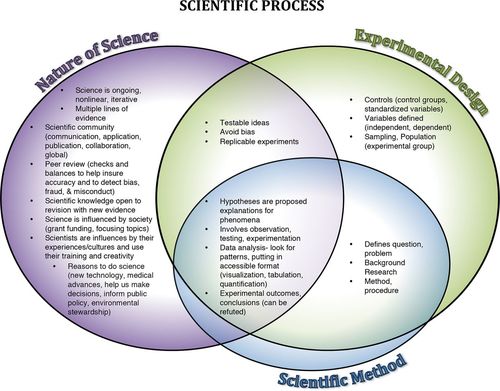
FIGURE 1. Venn diagram of the scientific process representing the overlapping ideas of the NOS, experimental design, and the scientific method. This diagram shows a holistic view of the scientific process. The scientific process contains the ideas of the NOS, experimental design, and the scientific method. The NOS is a description of science as a way of knowing, how science is conducted, and the everyday aspects of the influences of science (University of California Museum of Paleontology, 2012; NGSS Lead States, 2013). Experimental design is the systematic approach to develop experiments that will gain interpretable understanding of the problem or question the experiment addresses (Sirum and Humburg, 2011). The ideas of the scientific method completely overlap with the NOS, experimental design, or both.
Many of the methods developed to assess students’ understanding of parts of the scientific process and the NOS rely on Likert-scale and multiple-choice questions (Gogolin and Swartz, 1992; Weinburgh and Steele, 2000; Stuhlsatz, 2010; American Association for the Advancement of Science, 2015). In his 2011 paper, Allchin argued that these methods rely too heavily on declarative knowledge instead of conceptual understanding, which oversimplifies the NOS (Allchin, 2011). These assessments reveal a student’s grasp of facts and concept definitions but do not evaluate the way students structure this knowledge (Novak, 2003). Likert-scale and multiple-choice questions also generally require large sample sizes to achieve statistically significant results. This may not be possible when evaluating research programs or small classes. Other methods of evaluating the NOS understanding use open-ended short-answer/essay questions in combination with time-intensive interviews (Lederman et al., 2002; Schwartz et al., 2004), which are equally challenging in certain contexts. We propose an alternative assessment to evaluate students’ conceptions about the scientific process using student-created visual representations that are variations of a concept map that we term “flowcharts.” Student visualizations play a key role in student thinking and problem solving (Novick, 2001; Novick et al., 2011; Hurley and Novick, 2010; Hegarty, 2011; National Research Council, 2012; Leenaars et al., 2013; Smith et al., 2013; Ortega and Brame, 2015; Quillin and Thomas, 2015).
Student-created visual representations are an important tool in developing and assessing student understanding, as they represent a student’s cognitive processes. Knowledge is represented in cognitive structures, or schema. These structures can change to accommodate new knowledge through the process of accretion, wherein new information is added to the existing cognitive structure without significantly changing the cognitive structure (Ifenthaler, 2010; Ifenthaler et al., 2011; Dauer et al., 2013; Speth et al., 2014). Tuning is the alteration of single components in a cognitive structure. If there is no cognitive structure present or if the new information does not fit within an existing cognitive structure, it undergoes reorganization to create new cognitive structures. These cognitive structures exist in long-term memory. Students construct a mental model in working memory from these cognitive structures that allows them to understand a specific problem or prompt. However, such models have to be expressed and made observable in order to be evaluated. The process of expression or making these mental models external occurs through speaking, drawing, or constructing a diagram, graph, or other visual representation (Ifenthaler, 2010; Ifenthaler et al., 2011). Dauer et al. (2013) articulated some assumptions about cognitive structures and how they can be assessed: 1) cognitive structures, composed of ideas and their relationships, reside in long-term memory and can be changed; 2) mental models develop in response to a prompt and are a product of the student’s cognitive structure; and 3) students’ visual representations are partial reflections of their mental models.
Visual representations such as concept maps and variations on concept maps like box-and-arrow plots or our flowcharts provide valuable tools for assessing student understanding. Concept maps are tools for organizing and representing knowledge and are used to show relationships among multiple concepts in a domain by arranging conceptual nodes, links between nodes, and labeled links (Allen and Tanner, 2003; Novak, 2003; Novak and Canas, 2007; Quillin and Thomas, 2015). Nodes are separated in boxes and represent ideas, processes, and physical structures. The linkages represent a relationship between the nodes. These approaches allow educators to assess the students’ knowledge, reveal their unique thought processes, and observe change in students’ understanding of concepts over time. Concept mapping and other visual representations illustrate both students’ deep content understandings and their misconceptions (Mintzes et al., 1999; Yin et al., 2005; Stautmane, 2012; Tas et al., 2012; Burrows and Mooring, 2015; Dauer and Long, 2015).
Concept maps have assessable units known as propositions. Propositions include a node, a link, and another node that can be evaluated for accuracy. The linkages (one way, two way, or nondirectional) between the nodes allow students to demonstrate hierarchical representations of their mental models of an entire body of knowledge using temporal or causal relationships between concepts. Box-and-arrow plots represent a subset of ideas that are relevant to a given function and specify that the nodes are structures and the linkages are behaviors between the structures (Dauer et al., 2013; Speth et al., 2014). Because box-and-arrow plots represent the nodes and links relevant to a function, they may have a specific context. This is in contrast to concept mapping and the flowchart, which are more generalized. Both concept maps and box-and-arrow plots require training and practice for their construction due to their use of specific symbols and regulated construction; in contrast, the only guidance for construction of a flowchart is the limited instruction within the prompt itself, and in this study, students only drew a flowchart for assessment. As a result, the flowchart requires less instructional time, linkages are not required to be labeled, and there is typically more variation seen in the structure of this representation. However, students with prior experience drawing other models or representations may be better able to represent their understanding during this evaluation.
The flowchart discussed in this paper uses an open-ended prompt. Open-ended prompts give students opportunities to 1) think about the connections between the terms, 2) organize their thoughts and visualize the relationships between key concepts in a systematic way, and 3) reflect on their understanding (Vanides et al., 2005). Assessment of these representations by how the concepts are organized reveal a holistic understanding that individual terms alone may not convey (Plotnick, 1997; Yin et al., 2005).
In this paper, we will evaluate students’ conceptions about the scientific process using student-created visual representations (flowcharts). This tool, the Scientific Process Flowchart Assessment (SPFA), will include a prompt and a rubric. To our knowledge, this is the only tool to use an open-ended prompt and visual representations to assess student understanding of the scientific process. We will evaluate the inclusion of scientific process ideas as represented by nodes. We will also evaluate how students visualize and organize the connection of information as represented by links. This paper will show the development of an open-ended prompt and a rubric applicable in multiple disciplines that allows for a reliable assessment of these visual representations of the scientific process in an effort to understand students’ cognitive structures and mental models pertaining to their perceptions of science.
METHODS
Prompt and Prompt Revision
To evaluate student understanding of the scientific process, we developed a four-sentence prompt that laid out instructions on how students should construct their flowcharts and guidelines by which their work would be assessed (Figure 2A). The prompt is designed to reflect the basic structure of the flowchart to increase similarity in its construction by students. This tool was developed for use with a broad set of students with respect to grade level and science experience. Therefore, a diverse focus group was used to optimize the specific language, ensuring communication validity such that the students understood the prompt as intended. The focus group was composed of two Introduction to Sociology classes from a small liberal arts university in the Midwest. These classes were selected because Introduction to Sociology is a general education course and contains a wide range of different majors and fields of study. The prompt had not been used as an assessment tool in this class. This focus group was given the prompt to interpret (Figure 2A). They were also asked to provide their gender, major, and age and to indicate whether they were freshmen, sophomores, juniors, or seniors. The focus group consisted of mainly freshmen and sophomore students and had a mix of majors (Supplemental Material 1A). Owing to the time of day when the courses were offered, there was a higher representation of athletes, and as a result, there was a greater proportion of males and business and sports performance/marketing majors in the sample than in the general university population. We collected 43 responses from the focus group.
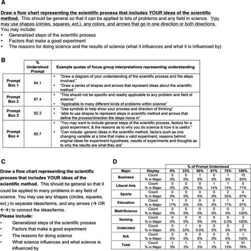
FIGURE 2. Prompt focus group and revision. (A) Original prompt with alternating underlined text representing how the prompt was split for interpretation by the focus group. The first sentence that is underlined is prompt section 1 and the next sentence that is not underlined is prompt section 2, etc. (B) Evaluation of focus group’s understanding of the prompt boxes. (C) Finalized prompt text. (D) A cross-table analysis of percentage prompt understood compared with major.
The focus group questionnaire broke down by sentence into four sections shown in alternating underlined text in Figure 2A. For each section, the focus group students were asked what they thought the prompt meant. The interpretations of the prompt were coded as 1) understood prompt, 2) did not understand prompt, or 3) did not follow focus group instructions/did not provide an interpretation. The prompt sections coded in the last category (number 3) are excluded from data analysis. However, exclusion of one prompt section did not exclude the rest of that student’s data from analysis. Representative quotes were collected from the students who understood the prompt, and all quotes were collected for the students who did not understand the prompt. Representative samples of both types of quotes are displayed. For each focus group participant, a percentage of prompt coded as “understood” was calculated. This was determined by dividing the number of prompt boxes coded as “understood” by the total number of prompt boxes completed according to focus group instructions. This percentage of “prompt understood” was then compared with major, gender, and year. Additionally, the focus group was asked whether any of the words in the prompt were confusing and what they thought the words meant in this specific context.
Overall, the prompt was very well understood, with an average across all of the prompt sections of 92.4% understood (Figure 2B). Even though the prompt was well understood, the focus group comments were very useful in revising the prompt. For prompt section 1, the comments focused on not understanding what the student was supposed to draw. This misunderstanding derives from an inability to understand what is meant by “flowchart.” This portion of the prompt was left as is, but revisions from prompt section 3, described below, may address this misunderstanding, as it provides instructions on how to build a flowchart. Prompt section 2 was understood by 97% of the focus group and was modified only slightly.
In prompt section 3, a few students were confused about when to use circles or arrows. Some example quotes are “I do not understand any colors & arrows that go in the same way or both ways,” and “How do you use circles to specify a direction?” The prompt was revised so that the shapes were followed by instructions of how shapes could be used to separate terms or ideas (Figure 2C). Likewise, the prompt was revised to state that the arrows could be used to connect terms or ideas and included a visual representation of arrows. This change was made to increase the clarity and conciseness of the prompt.
Prompt section 4 accounted for the largest percentage of focus group participants coded as not understanding (14.3%). The last bullet point of prompt section 4 was separated into two bullets and prepositions were removed to increase clarity. Also, the comments involving interpretation of the “You may include” phrase from the original prompt indicated that the students thought they did not need to follow this direction. Therefore, the prompt was modified to “Please include,” so students would understand that these elements are being assessed.
Because the focus group consisted of students from a variety of majors, we wanted to demonstrate that there was no major-dependent difference between the levels of understanding. A cross-table analysis and chi-square test were performed comparing the student’s major with the percentage of prompt understood (Figure 2D). The chi-square test had a p value that indicated no significant difference by major in the percentage of the prompt understood. Likewise, chi-square analysis comparing gender and age showed no significant difference in percentage of prompt understood. This means that the prompt has multidisciplinary applicability, so the method may be used to test understanding of the scientific process in many different classes across a variety of disciplines.
Flowchart Sample
Multidisciplinary applicability for SPFA including both the prompt and the rubric was demonstrated by the collection of 40 flowcharts from two Introduction to Sociology classes that included students from a large variety of majors (Supplemental Material 1B). This sample was a different group of students from the focus group.
Additionally, 26 flowcharts, consisting of 13 paired pre and post flowcharts, were collected during a science, technology, engineering, and mathematics (STEM) research program for middle and high school students held in the summer of 2013 (examples in Figure 3). The pre flowchart, given the first day the students enter the program, was a baseline measure of the students’ understanding of the scientific process. The post flowchart was given after their research experience and curriculum on experimental design. Students performed authentic research projects that they designed with faculty guidance. The program included an exploration of the scientific process using both the Understanding Science teaching model (Supplemental Material 2) and targeted activities, such as variables, controls, data analysis, and accounting/controlling for bias (Supplemental Material 3). In addition to completing the flowchart, both the multidisciplinary students and the summer students were asked applicable demographic questions about their majors, class rank, and ethnicity.
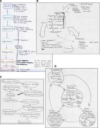
FIGURE 3. Example pre and post scientific process flowchart. Representing two students pre (A and C) and post (B and D) flowcharts in response to prompt.
Rubric Development
A rubric for evaluating and assessing the flowcharts was developed first by addressing the central concepts and common features of flowcharts, such as one-directional arrows and two-directional arrows. The central concepts assessed by this rubric are 1) science is ongoing, unpredictable, and nonlinear; 2) science and society affect each other; 3) experimental design is critical for interpretable scientific findings; and 4) a scientific community is necessary for scientific progress (communication, collaboration, and theory building). This rubric was revised and updated throughout the flowchart assessment coding process to ensure that the rubric accounted for the variation in the student-generated flowcharts. After the rubric revision process, all flowcharts were recoded.
The rubric has five basic dimensions with a sixth summary dimension (Figure 4). The dimensions are 1) connections, 2) experimental design, 3) reasons for doing science, 4) nature of science, and 5) interconnectivity rating. Rubric dimension 6 is not a stand-alone dimension. Instead, it is an overarching parameter covering the overall sum item count and sum rating that becomes the student’s item and rating scores. The learning objectives about the NOS are evaluated throughout the rubric, including dimensions 1, 3, 4, and 5. For example, the dimension titled “nature of science” allows evaluators to rate the student’s understanding of the connections between society and science, how the scientific community works together, and the concept that multiple lines of evidence are necessary to answer a question. The “reasons for doing science” dimension also addresses the NOS, in that it measures recognition that science is not just theoretical or esoteric but can lead to improvements in daily life. This demonstrates an understanding of the connection between society and science. Additionally, the connections and interconnectivity rating assess formatting of the flowchart that can demonstrate a student’s understanding of science as a nonlinear, unpredictable, and ongoing process.
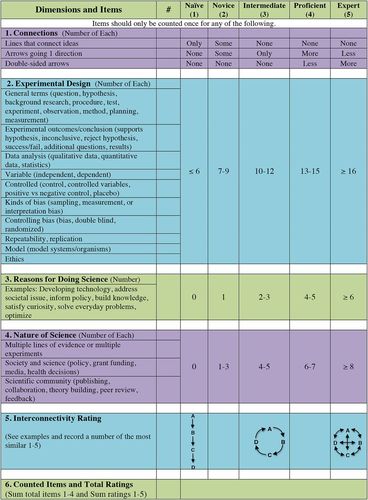
FIGURE 4. Rubric used to analyze scientific process flowchart.
The experimental design dimension incorporates ideas from the general terms representing the scientific method, including question, hypothesis, experiment, and conclusion. In addition to these ideas, there are key experimental design features that are important in experimentation regardless of the field of study, including research ethics, controlling experiments, and minimizing bias. An understanding of these experimental design features is important not only for students when designing their own experiments but also for determining the quality of completed experiments in journal articles. This section’s list of possible items allows for variation between fields. It is unlikely that a student would happen to include all of these terms, but including this variety would allow for assessment of students who possess a broad understanding of science.
Each flowchart is ranked in each dimension as 1) naïve, 2) novice, 3) intermediate, 4) proficient, or 5) expert. Dimensions 2 through 4 are evaluated based on rubric guidelines concerning item counts within the flowcharts. Dimensions 1 and 5 are evaluated by the rater of the flowchart using the rubric-suggested criteria. Rubric dimension 5 contains the overall sum item count and sum rating that becomes the student’s item and rating scores. Detailed instructions for rubric use can be found in Supplemental Material 4. Overall, the prompt and rubric will be called the Scientific Process Flowchart Assessment (SPFA).
Determining Interrater Reliability
Scanned flowcharts were randomized before identifying numbers were assigned, so raters could not tell which flowcharts were paired and which were pre- or postinstruction. (Although handwriting could make evident which charts were paired; this was unavoidable.) The flowcharts provided were printouts instead of originals, so each rater could mark his or her copies in the process of tallying each idea/item/phrase when using the rubric. The raters included three faculty members, one from each of the following disciplines: biology, sociology, and psychology. Three undergraduates, two work-study students and one student who had previous experience with education research, also rated the flowcharts. All raters met for 1 hour to discuss the rubric and its instructions and then rated one flowchart that was not a part of the experimental sample set. This flowchart’s rating was discussed, and the raters were provided with the flowcharts, instructions, and an Excel file to record their rubric scores. The data from each evaluator were then analyzed for variance and significant differences between pre and post flowcharts from the summer program. The data were also analyzed for significant differences between evaluators. This was done to evaluate the interrater reliability.
The overall average variance between evaluators was low for both sum ratings and sum item number (Supplemental Material 5A). The variance was calculated for rating and item number scores between primary evaluator and other faculty and undergraduate evaluators. A positive variance indicates higher sum rating or sum item number scores, and negative variance indicates lower rating or item number scores. The average variance is −0.2 for the rating score and 0.9 for the item score. All the evaluators’ ratings of the flowcharts showed a significant difference between pre and post flowcharts from the summer program for the average sum ratings, and all but one evaluator rating showed a significant difference between pre and post for average item number (Supplemental Material 5, B and C). The magnitude of the change between pre and post flowcharts and the absolute sum ratings and sum item number vary slightly by evaluator. However, there is no significant difference between any of the evaluators for average sum ratings and average sum item number as calculated by a Friedman test with a Dunn’s multiple comparison test. The low variance and lack of significant differences between evaluators demonstrates that this rubric has high reliability.
Assessing Specific Connections and Multiple Structures
Specific connections were identified as important to understanding the scientific process. For each identified specific connection, the flowcharts were coded as 1) terms not present, 2) terms are present but not directly connected, or 3) terms are present and connected as detailed.
The presence of multiple structures within a single flowchart was also assessed. A flowchart with multiple structures has nodes/ideas that are unconnected to the flowchart, in the form of either additional lists or separate flowcharts. Flowcharts were coded for having multiple structures and represented as a percent of the overall flowcharts in a sample. Some examples of flowcharts with multiple structures are in Supplemental Material 6.
Data Analysis
The cross-tables and chi-square analysis for the focus group data were performed using SPSS. The p values for the comparison of pre and post sum ranking and sum item number were determined with a Wilcoxon matched-pairs signed-rank test (a nonparametric paired analysis) using GraphPad Prism. The web figures displaying the individual or program average ratings were made using Microsoft Excel. A Friedman test with Dunn’s multiple comparison using GraphPad Prism was performed on interrater data to evaluate differences between evaluators.
RESULTS
SPFA Is Applicable to a Multidisciplinary Group
SPFA was used to analyze two separate groups of students. The first, a multidisciplinary group of undergraduates from a variety of majors, created flowcharts based solely on prior education; and the second, a group of middle and high school students in a STEM summer research program, created flowcharts pre and post their curriculum and research experience. The multidisciplinary group of undergraduates was found to be demographically similar to the university population of traditional undergraduates, having a similar distribution of majors (the university having 24.4% majoring in business, 23.8% majoring in liberal arts, 7.9% majoring in exercise science or sports performance, 7.6% majoring in education, 14.3% majoring in math or science, 18% majoring in nursing, and 4% exploratory), and a similar distribution of ethnicities (1.3% Asian, 9.3% Black/African American, 75.2% white, 6.5% Hispanic/Latino, 5% other, and 2.7% identifying with multiple ethnicities). However, the undergraduate group was found to be slightly more female when compared with the university population (51.5% female; Supplemental Material 1B).
The purpose of these analyses was first to determine baseline flowchart characteristics and then to determine whether the SPFA was applicable to a variety of undergraduate majors and differing levels of student skill. In these applications, SPFA was used to determine similarities and differences between and among the groups of flowcharts. The rubric revealed that, without intervention, the different undergraduate majors were similar in their overall item sum and overall rating sum (Figure 5A). The total average sum rating and SE was 9.6 ± 0.3 for all undergraduates. This corresponds to a novice rating (Figure 4). In practice, the undergraduate students rated an average of 2.9 ± 0.1 for connections, 1.8 ± 0.1 for experimental design, 1.7 ± 0.1 for reasons for doing science, 1.5 ± 0.1 for nature of science, and 1.7 ± 0.2 for interconnectivity. These individual ratings correspond to naïve, novice, or intermediate ratings. Divided into undergraduate majors, the major with the lowest average sum was education (9.0 ± 2) and the highest major was math and sciences (11.7 ± 0.8). This does not represent a large range in the average sum ratings, and we believe that this sum rating can be viewed as a baseline for this population.
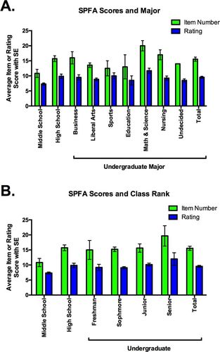
FIGURE 5. Sum item number and rating by major and class rank for multidisciplinary students completing the flowchart. Overall comparison of pre and post flowchart sum of the ratings displayed by (A) major and (B) class rank. 1 = naïve; 2 = novice; 3 = intermediate; 4 = proficient; and 5 = expert. The total possible rating total is 25, and the lowest possible rating is 5.
Analysis reveals that there was little difference in average sum ratings when examining class rank (Figure 5B). No statistically significant difference was observed between the average sum ratings of the high school pre flowchart and college senior samples (9.9 ± 0.7 and 12 ± 2, respectively). The lack of difference between the seniors and the high school students is surprising. However, it is important to note that this group of high school students is unlikely to be representative, because they self-selected to participate in a summer research program and are likely working at a higher level than most middle/high school students. The seniors were, on average, at the novice rankings; this implies that improvement in understanding of the scientific process does not occur without direct intervention.
Analysis of Connections Reveal Opportunities for Intervention
In addition to examining the overall item and rating scores as evaluated by the SPFA rubric, we also evaluated flowcharts on specific connections. The connections examined are detailed in Figure 6A. The connections were chosen as a metric in order to recognize specific features of how and why science is done that are often overlooked or missing in representations. These factors also have been recognized as critical by science standards (NGSS Lead States, 2013). These connections are categorized as input, output, and society connections. The presence of these connections in student flowcharts demonstrates higher-order understanding of the scientific process in terms of Bloom’s taxonomy in how to apply, analyze, and evaluate the scientific process (Crowe et al., 2008). These connections were evaluated on a three-point scale, with 0 representing that one or both terms were not in the flowchart, 1 representing that the terms were present but not connected as illustrated, and 2 representing that the terms were both present and connected as illustrated.
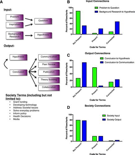
FIGURE 6. Input and output functions for multidisciplinary students completing the flowchart. (A) Illustration of connections that were examined and counted for the following analysis. (B) Percent of students with specific input connections. (C) Percent of students with specific output connections. (D) Percent of students with connections related to society.
“Input” connections represent the inspiration motivating the experiment and the facts/information collected to inform experimental design. The first encompasses either interpretation or a problem connected to a scientific question. The second encompasses background research connected to a hypothesis. For our undergraduate sample, the flowcharts largely did not incorporate the inspiration that motivates the asking of a question from which the experiment is designed. Only 9.4% of the flowcharts had problem or inspiration connected to the question. In contrast, 47.2% of this sample connected background research to hypothesis (Figure 6B). Many students are able to define a hypothesis as an educated guess. Many students recognize that this means that the prediction inherent to the hypothesis is informed by previous work done.
The “output” connection examines a common feature of many representations of the scientific method; the conclusion reconnects to the hypothesis. This shows that the hypothesis can be revisited in response to conclusions drawn from experimental data. A second “output” connection is the connection of the conclusion to a communication with the scientific community, including terms like “communication,” “peer review,” “publication,” “theory building,” or “collaboration (Figure 6A). For the multidisciplinary undergraduate sample, “conclusion” was connected back to hypothesis in 15.1% of the flowcharts. This was surprising, considering how common this feature is in representations of the scientific method. “Conclusion” was connected to “communication” in 22.6% of the flowcharts, indicating a majority of the students did not recognize the importance of communicating scientific results and conclusions (Figure 6C). This is a significant deficit in a student’s understanding of the scientific process.
“Society” connections are defined by a larger number of terms, not limited to the list provided (Figure 6A). Differentiation between society connection inputs and outputs is determined by adjacency and connection to position in the flowchart. A society connection input would be closer to question/problem/hypothesis. A society connection output would be closer to data or conclusion. Conceivably, with an interconnected flowchart, society connection inputs and outputs could not be differentiated and could count for both. In practice, the students in the multidisciplinary undergraduate sample had terms representing society present in their flowcharts but not connected as either inputs or outputs. These terms were often in separate structures outside the main body of the flowchart. Terms representing society were only present in 18.9% of flowcharts, and only 1.9 and 3.8% of flowcharts had these terms connected as an input or output, respectively (Figure 6D). These analyses show areas that could be targeted for curricular intervention or incorporated into authentic experiences like mock study sections for grant review or peer review for student papers.
The Scientific Process Flowchart Shows Significant Difference Pre to Post
SPFA was applied to flowcharts made by the students in a summer research program. The pre flowchart was taken as the baseline measure of the students’ understanding of the scientific process upon entry into the research program. The post flowchart was examined to determine any differences in understanding after the completion of the research experience and curriculum on experimental design. Data indicate differences from pre to post flowchart in both the overall item and overall rating scores. The increase in average number of items per flowchart indicates a statistically significant improvement from pre to post (Figure 7A). The average value increased from 13 ± 1 to 21 ± 2 items per flowchart. Similarly, the overall average rating score per flowchart shows a statistically significant improvement from pre to post (Figure 7B). Specifically, the pre flowchart rating score was 8.7 ± 0.5, indicating a novice rating over the five dimensions. The post flowchart showed improvement, with a rating score of 14 ± 1 that indicates an intermediate rating over the five dimensions.
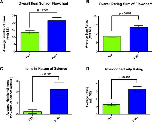
FIGURE 7. Significant differences pre to post flowchart. p Value was calculated using a Wilcoxon matched-pairs signed-rank test. (A) Overall comparison of pre and post flowchart sum of items from rubric dimensions 2 through 4. (B) Overall comparison of pre and post flowchart sum of the ratings, where 1 = naïve; 2 = novice; 3 = intermediate; 4 = proficient; and 5 = expert. The total possible rating total is 25, and the lowest possible rating is 5. (C) Average number of items in the NOS, rubric item 4, in pre and post flowchart. (D) Average interconnectivity of pre and post flowchart.
This average rating score was examined to determine how the increase was reflected across the five dimensions. For example, the largest increases occurred in the nature of science and interconnectivity ratings. The average number of items for nature of science increased from 0.1 to 2.4 (Figure 7C). This is a statistically significant improvement pre to post. This dimension encompasses ideas of multiple lines of evidence, the interaction between society and science, and the involvement of the scientific community. Of these ideas, the involvement of the scientific community represented 66% of the items in that category on the post SPFA; peer review, publication, and collaboration were the items frequently included. An examination of the flowchart interconnectivity ratings revealed a statistically significant improvement in average ratings, pre to post (Figure 7D). On average, the pre rating for interconnectivity was 1.3 ± 0.2, corresponding to a naïve rating, indicating a linear arrangement of items in the flowchart. The average post rating was 3.3 ± 0.3, an intermediate rating, indicating a circular flow of items. This demonstrates the students’ recognition that science is not linear and is interconnected.
The five assessed dimensions of SPFA were graphed using web plots to show the changes in ratings from pre to post. A green line represents pre and a blue line represents post, with each web terminus labeled with the dimension number and title (Figure 8). The central axis has the ratings starting at 1 and each webbed line represents an increased rating up to 5. These ratings correspond with the naïve to expert ratings evaluated by SPFA. Flowcharts that are farther from the central point indicate a increased rating and a better understanding of that dimension of the scientific process. Figure 8, A and B, are web plots of the two flowcharts in Figure 3, A and B, and Figure 3, C and D, respectively. The web plot can also be used to display average changes in the flowchart ratings (Figure 8C) making it easy to assess which dimensions showed the most improvement.
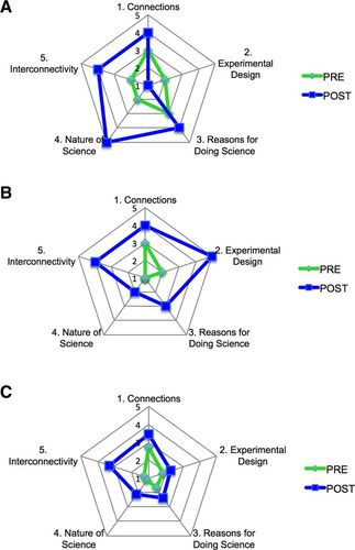
FIGURE 8. Web representation of change in ratings from pre to post flowchart. A green line represents the pre flowchart and a blue line represents the post flowchart. (A) Web of individual ratings from example flowchart in Figure 3, A and B, showing both pre and post flowchart data. (B) Web of individual ratings from example flowchart in Figure 3, C and D, showing both pre and post flowchart data. (C) Web of average ratings for both pre and post flowchart.
Change in Terms Used to Describe Experimental Design but Not “Classic” Scientific Method Pre to Post Flowchart
The summer program students’ pre and post flowcharts were examined for changes in the specific terms used to refer to experimental design (dimension 2 of the rubric). No significant difference was found between the average number of items representing “classic” terms in the scientific method pre to post flowchart (Figure 9A). These “classic” terms to describe the scientific method are based on the terms frequently present in instructional materials, including: question/problem, hypothesis, background research/planning, method/materials/procedure, and experiment/observation/test/measurement. It is interesting that, as interventions were applied and curriculum covering the scientific process was presented, it did not result in replacement or shifting of terms.
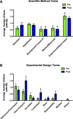
FIGURE 9. Experimental design terms pre to post flowchart. Breakdown of sum item count for rubric dimension number 2. (A) Average scientific method terms in pre and post flowchart. (B) Average experimental design terms in pre and post flowchart.
Analysis of the pre and post flowcharts for terms associated with experimental design did reveal some differences. There was a statistically significant increase in terms associated with data analysis (Figure 9B). Data analysis terms from this summer program include interpreting data, statistics, data graphing, analysis, correlation, comparing with expected results, and building charts. Other relevant terms that were not observed could include analysis of mean/average, SD/SE, and names of specific statistical tests. In addition to the noted increase in associated terms, there was a trend for the increased mention of controlled experiments and repeatable experiments. Terms included in controlled experiments were: positive control, negative control, placebo, and standardized variables. An advanced experimental design term that did not significantly increase despite curriculum presentation was bias (including types of bias; sampling, measurement, or interpretation, or methods to control bias; double-blinded design or randomized assignment to groups). The experimental design terms that increased in use seemed to be connected to the things the summer research students actually did as opposed to those they were only told about. For example, the students had to design controls into their experiments, repeat their experiments multiple times, and do significant data analysis.
Curriculum and Authentic Experience Resulted in an Increase of Important Connections
Connections from the summer program pre and post flowcharts were assessed using the method described for the multidisciplinary sample. There was a shift in the percent of flowcharts that had the terms and had them connected in the way pictured in Figure 6A. In the case of the input connection between inspiration/problem and question, there was a threefold increase from 7.7 to 23.1% in flowcharts (Figure 10A). Likewise, with output connections, there was a large shift, with conclusion connected back to hypothesis present in twice as many flowcharts, increasing from 15.4 to 30.8%, and conclusion connected to communication present in 3.5 times as many flowcharts, increasing from 15.4 to 53.8% (Figure 10B). These dramatic increases in incidence show recognition of the idea that the experiment does not end with the conclusion but with sharing and communication of findings. From pre to post, society connections increased for both the defined input and output functions, increasing from 0 to 30.8% on the input and from 7.7 to 30.8% on the output (Figure 10C).
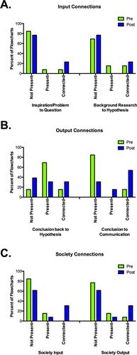
FIGURE 10. Input and output functions pre to post flowchart. (A) Percent of students with specific input connections. (B) Percent of students with specific output connections. (C) Percent of students with connections related to society.
Analysis for the Presence of Separate Structures
The prompt describes a list of elements for students to include in their flowcharts. When drawing their flowcharts, some students chose to put these elements in separate structures instead of in the main body of the flowchart. For example, a student would have a flowchart and then a bulleted list containing reasons for doing science. The presence of these separate structures indicates a lack of integration in their understanding. In the multidisciplinary sample, 60% of the flowcharts contained separate structures. In the summer research program, 31% of the pre flowcharts contained separate structures and 15% of the post flowcharts contained separate structures. The intervention in the summer research program decreased the presence of separate structures.
DISCUSSION
To evaluate students’ understanding of the scientific process, experimental design, and the NOS, we developed the Scientific Process Flowchart Assessment, or SPFA, consisting of a prompt and rubric. SFPA was successfully applied to assess a multidisciplinary sample of students. The flowcharts examined showed consistent construction and rubric scores. Additionally, SPFA was very effective in measuring the changes in understanding from a pre to a post flowchart. Rubric analysis for overall complexity and structure and analysis of specific terms or connections demonstrate how this tool can be used to achieve multifaceted data showing the effects of curricula and experiences.
On the basis of our findings, we propose four main affordances of SPFA. First, it can be used with a fairly small sample size. Second, SPFA could be applicable to many different disciplines that teach the scientific process, such as sociology, psychology, biology, chemistry, physics, and engineering. Third, SPFA can be completed by students without prior training in concept mapping or other representation techniques. Fourth, SPFA rewards parsimony by eliminating double-dipping with repeated items and excluding items that do not fit into specific categories.
We propose three main limitations inherent to SPFA. First, students could memorize the instructional figures, like the Understanding Science Teaching model, instead of applying their own understanding of the scientific process. In practice, students did not replicate the Understanding Science Model categories or terms, although some did use the format. This is possibly due to the length of time between presenting this teaching model and the post flowchart. Instead the teaching model serves as an example of how representations of the scientific process can be different from what was likely presented in instructional materials earlier in their education. We would argue this is not training students to build more nuanced flowcharts, as they are not drawing practice flowcharts throughout the intervention time.
Second, SPFA cannot assess whether or not students can use and apply the ideas they depict in their flowcharts. For instance, including “positive controls” on the flowchart would not indicate whether or not students could identify a positive control in an experiment or design positive controls for their own experiments. Therefore, SPFA should be combined with other assessment tools to determine whether students fully understand and can apply ideas represented on their flowcharts.
Finally, SPFA cannot currently be assessed using computer-aided technology, unlike multiple-choice response categories, Likert-scale response categories, or Scantron tests. Analysis of the flowcharts according to the rubric typically takes less than 5 minutes, with an additional 1–2 minutes for coding for connections and multiple structures. This time is not dissimilar from assessing short-answer or essay questions. The time investment is further mitigated by the use of undergraduate teaching assistants or research assistants to perform the assessment by collecting the data and conducting preliminary analyses. Furthermore, there is the possibility that this analysis could be made electronic in the future.
We propose that others may use this tool in a basic experimental design consisting of a pre flowchart, scientific process education or research experiences, and a post flowchart. The pre flowchart is the baseline measure of students’ understanding of the scientific process. The pre flowchart then could be used to determine specific intervention topics to discuss tailoring the class or program to the needs of the specific students. The scientific process education may consist of curricula or group/individual research projects. Some examples of curricular options may include the Understanding Science website, experimental design activities/practice, or current event topics that show the connections between science and society. The understanding gained from research projects or curricula can be assessed by comparing the baseline (pre flowchart) with the post flowchart. This experimental design is useful under many different circumstances. For example, it could be used to evaluate the effectiveness of curricula and programs in the context of classes (in part or whole), assignments, and/or research programs.
While primarily designed as a programmatic assessment, SPFA can also be used as a formative assessment tool. For example, instructors could keep flowcharts from the beginning of a research program and then ask students to evaluate their own flowcharts midway through a program. Were their flowcharts good representations of how they conducted their research? Was the order representative of what they did? Which parts of their research were not represented in the flowcharts? Following the discussion, students could redraw their flowcharts according to the prompt to reflect their changed views of the scientific process. Alternatively, instructors could make the process each student uses more overt by adding required elements to oral presentations in which students discuss their projects and data. This would enable discussions of not only how their projects are going but also the generalized process of how science is done. Similarly, instructors could provide feedback on flowcharts and allow students to redraw them to reflect their new understanding. This kind of formative assessment may change the utility of this tool made for programmatic assessment, since the opportunity to redraw and practice could train students specifically in the design of improved flowcharts; however, in specific instances, the learning gains may outweigh assessment needs.
This assessment reveals student knowledge structures through student-created visual representations. Analyzing these representations allows a holistic understanding that would be difficult to express in individual terms or in the context of short-answer or essay questions (Plotnick, 1997; Yin et al., 2005; Quillin and Thomas, 2015). This format further allows for the demonstration of critical elements of the scientific process, specifically that science is nonlinear, unpredictable, and ongoing (Lederman et al., 2002; Schwartz et al., 2004). Analysis of these flowcharts unexpectedly revealed incidence of separated structures instead of completely integrated flowcharts. We hypothesize that these separate structures indicate the presence of separate cognitive structures of the scientific process. What influences the construction of these separate structures and what leads to an integrated flowchart could be explored in future studies. Another future direction of SPFA should include an examination of the effects of undergraduate research (in or out of the classroom) on students’ understanding of the scientific process. Specifically, it should be explored in more detail whether undergraduate research helps students link visualizing the connection of information in the scientific process to how they use the scientific process to solve problems or do research.
ACKNOWLEDGMENTS
We thank Dr. Laurel Camp from Marian University Psychology Department, for helping us with the interrater reliability, and undergraduates Pamela Opeonya, Mary Schubnell, and David Doub. We also thank the summer program directors and administrator, Dr. Kimberly Vogt, Dr. Samantha Oliphant, Ginny Smith, and Marian University School of Mathematics and Sciences for funding for summer program. Thanks also to Dr. Allison Chatterjee from Marian University College of Osteopathic Medicine for critical reading of the article.


