“Seeing” Data Like an Expert: An Eye-Tracking Study Using Graphical Data Representations
Abstract
Given the centrality of data visualizations in communicating scientific information, increased emphasis has been placed on the development of students’ graph literacy—the ability to generate and interpret data representations—to foster understanding of domain-specific knowledge and the successful navigation of everyday life. Despite prior literature that identifies student difficulties and methods to improve graphing competencies, there is little understanding as to how learners develop these skills. To gain a better resolution of the cognitive basis by which individuals “see” graphs, this study uses eye tracking (ET) to compare the strategies of non–science undergraduates (n = 9), early (n = 7) and advanced (n = 8) biology undergraduates, graduate students (n = 6), and science faculty (n = 6) in making sense of data displays. Results highlight variation in how individuals direct their attention (i.e., fixations and visual search patterns) when completing graph-based tasks as a function of science expertise. As research on the transition from novice to expert is crucially important in understanding how we might design curricula that help novices move toward more expert-like performance, this study has implications for the advancement of new strategies to aid the teaching and learning of data analysis skills.
INTRODUCTION
Graphical displays of data are becoming increasingly prevalent in today’s society, given innovations in communication and how complex data sets are generated and analyzed (National Science Board, 2016). Given the value of graphs in effectively communicating quantitative data (Tufte, 1983), graphical literacy (or the ability to generate and interpret graph data; Fry, 1981) is widely recognized as a core competency in undergraduate education (e.g., National Council of Teachers of Mathematics [NCTM], 2000; Association of American Medical Colleges [AAMC], 2009). This competency is particularly crucial in the science, technology, engineering, and mathematics [STEM] disciplines, as major and nonmajor students are regularly asked to make sense of and use graphical representations to succeed in their course work and research (e.g., McDermott et al., 1987; Speth et al., 2010; Angra and Gardner, 2017). More broadly, there is critical need for students to develop these skills both to communicate within their careers and to act on quantitative data in their daily lives to inform personal decision making and opinions on public policy as educated citizens (Padilla et al., 1986; American Association for the Advancement of Science [AAAS], 2011).
One’s ability to generate or interpret graphs is widely held as a core competency in undergraduate education (e.g., NCTM, 2000; AAMC, 2009; AAAS, 2011). However, it has been well-documented that college students demonstrate deficiencies in understanding and using this form of data (as reviewed by Glazer, 2011). Prior studies report on a range of common issues mitigating science and non–science undergraduates’ abilities in deriving meaning from graphs generated by themselves or others (or graph comprehension; Friel et al., 2001), including proper variable identification, appropriate use of common graph conventions, interpreting mathematical functions (e.g., slope height), scaling, translating abstract graph data to real-world concepts, and conceiving data relationships (McDermott et al., 1987; Bowen et al., 1999; Kozhevnikov et al., 2007; Picone et al., 2007; Speth et al., 2010; Maltese et al., 2015). Given this, it is understandable that students often struggle when faced with graph data, as such obstacles limit appropriate progress through the hierarchical steps involved in graph reading: 1) reading the data, 2) reading between the data, and 3) reading beyond the data (Curcio, 1987). In fact, extant research indicates that the less expertise a learner possesses in data analysis, the more prone he or she is to errors in the lower steps of this hierarchy, as graph comprehension is assumed to develop gradually through practice (Friel et al., 2001; Sharma, 2006).
Examining differences in problem solving between experts and novices is key to helping novice learners move toward more expert-like performance (Hmelo-Silver, 2004).1 Prior research suggests that experts use prior knowledge structures to perceive and recognize patterns and problem-solving behaviors in a domain that allows them to “see” a problem differently from how novices do (Chi et al., 1981; National Research Council [NRC], 2000). Taking a closer look at expertise in graph comprehension, a large body of research demonstrates that the ability to make sense of and use graph data and learn interpretive skills is strongly influenced by one’s prior knowledge and experience with the content/context of the graph (e.g., Bowen et al., 1999). As an example, Roth and Bowen (2001) used various interpretation tasks and interviews to evaluate the graphing competencies of practicing scientists when confronted with unfamiliar data from outside their respective areas of expertise. On the basis of the common difficulties demonstrated by the scientists (e.g., interpretative errors due to misreading signs), Roth and Bowen found that graph comprehension is tightly connected to one’s embodied understanding of the domain and its representational practices.
In relation to representational practices, existing studies on graphing expertise examined how design characteristics may affect the cognitive processes that underlie data interpretation (e.g., Zacks and Tversky, 1999; Goldberg and Helfman, 2011; Kosslyn, 2006). In one such set of studies, Ali and Peebles (2011), Peebles (2013), and Peebles and Ali (2015) gathered think-aloud data from participants of various backgrounds in psychology as they completed pen-and-paper tasks to test the influence of graph format on diagrammatic reasoning. The authors found that graph type (line vs. bar) affected novices’ abilities to draw appropriate inferences from the data, whereas experts demonstrated comparable performance levels for both formats. Similarly, in comparison to novices, experts were not affected in their interpretation by other graph features such as the relative sizes of effects (Peebles, 2013). These results may be due to experts having more developed pattern-recognition processes than their novice counterparts, allowing them to more rapidly and correctly draw inferences from graph data independent of format (Peebles, 2013; Peebles and Ali, 2015). In contrast, due to incomplete prior knowledge structures, novice graph interpretation is characterized as relying on the use of surface features (e.g., graph type, color) constraining the transfer of information to new representations (Kozma and Russell, 1997; Kosslyn, 2006).
However, despite the valuable insight lent by this type of work, data gathered on graph interpretation using pen-and-paper tasks and retrospective accounts can be constrained by a number of factors (e.g., incomplete recall). In response, several studies used eye tracking (ET) as a tool to more directly evaluate the underlying cognitive processes involved in making sense of graphics (e.g., Mayer, 2010; Stofer, 2016). ET technology captures one’s point of gaze (POG) as it shifts over time and space, providing insight into a subject’s attentive behavior (Duchowski, 2002). Two common eye-movement metrics are used for this: fixations and saccades. A fixation is a time interval (often established between 100 and 200 milliseconds) that the POG remains relatively stable as the viewer is interpreting given information in a scene (Rayner, 1998). The duration of fixation acts as an indicator to the cognitive complexity of the presented information for the viewer, whereas the number of fixations and total gaze time within a region suggests its perceived importance (Henderson and Hollingworth, 1998). Saccades are rapid eye movements between locations. While the viewer processes no information during these voluntary movements, the sequence of fixations by location over time and space provides insight into strategic approaches used in problem solving (Duchowski, 2002, 2007). As one naturally directs one’s attention (or the concentration of mental activity) to interpret an image, a close link exists between eye-movement metrics and cognitive processes (e.g., Jacob and Karn, 2003; Duchowski, 2007). In this way, as noted by Mayer (2010), ET offers “a unique opportunity” to gather evidence on how people learn and think within a wide range of graphics, including scientific data visualizations such as maps (Ooms et al., 2014; Stofer, 2016), textbook pictures (Slykhuis et al., 2005), animations (de Koning et al., 2010), and graphs (Tai et al., 2006; Libarkin et al., 2013).
Using ET technology to evaluate the effect of expertise on graph interpretation, Tai and colleagues (2006) compared the eye-gaze behaviors of six preservice teachers with different science subject backgrounds (chemistry, biology, physics) while they were solving standardized problems including graph data. As predicted, the authors found student eye movements were affected by the extent of expertise in the subject in which the tasks were situated. Specifically, students with higher levels of content familiarity required fewer eye fixations and saccades to process information than their more novice-like peers. More recently, to help inform instructional practices, ET techniques have been used to identify and analyze differences in how individuals with little knowledge and “experts” interact with discipline-based or specialized graph data. As an example, Topczewski et al. (2016) compared the eye movements of introductory organic chemistry students with those of graduate and advanced undergraduate students when interpreting nuclear magnetic resonance (NMR) spectra—a common technique within the field. Substantial differences were noted between the two groups: the introductory students had a more sporadic gaze pattern distributed across the graph, whereas the more experienced students focused on specific areas of interest in making sense of the data. Similarly, Atkins (2016) found notable variation in the search and fixation patterns of undergraduates and science experts (geoscience graduate students) when faced with five climate change graphs from the U.S. Environmental Protection Agency. In particular, undergraduates focused more attention on graph elements that helped them read the data (e.g., question text, title), but graduate students focused on information (e.g., data trends, legends, axis labels) that helped them better understand the data being presented. However, there are two ways such ET results may be constrained in understanding how individuals make sense of graph data. First, it can be argued that advanced undergraduates and graduate students generally lack the collective experiences necessary to act as expert group members (Ericsson and Charness, 1994), because they often demonstrate graphing difficulties comparable to those of more novice-like learners (e.g., Shah and Carpenter, 1995; Shaffer and McDermott, 2005; Maltese et al., 2015). Second, using highly discipline-specific data displays may represent more of an assessment of content and context understanding (Roth and Bowen, 2001) than a measure of a general ability to read and interpret graphs.
DESCRIPTION OF STUDY
Collectively, what we know about the effect of expertise on graph comprehension is that experts and novices interpret data differently and that identified differences can help inform our instructional practices. Most prior work approached the issue as a dichotomy contrasting differences between end members rather than along a continuum of expertise (e.g., Bowen et al., 1999; Topczewski et al., 2016). Surprisingly little is known about the progression of graph reading and interpretation skills in postsecondary science. We designed the present study to address this gap in our understanding by examining the approaches of individuals with various levels of scientific expertise—from non–science students to practicing STEM professionals—as they attempted to make sense of and use graph data. More specifically, using eye-movement data supplemented with interview questions, we examined the similarities and differences in the interpretive strategies of individuals when completing graph-based tasks focused on science-related topics drawn from everyday sources (e.g., medical pamphlets). Here, we sought to answer the question: How do individuals along a continuum of scientific expertise differ in how they read and interpret graph data? This research extends our pilot work (Harsh and Maltese, 2013; Harsh et al., 2013) and others’ earlier research on expertise in graph interpretation by explicitly examining differences in the decision-making processes of students and scientists. Our goal is not to determine what skills experts possess and novices lack, but to see what differences may exist as a function of scientific training that can be used to inform the development of graph literacy. Based on prior data-visualization literature (e.g., Atkins, 2016; Angra and Gardner, 2016; Stofer, 2016; Topczewski et al., 2016), it is anticipated that variation will exist between experts and novices in how they direct their attention during task completion when seeking meaningful information and that this knowledge might provide insight to help guide students in transitioning from novice to expert-like performance or “learning how to see” like experts (NRC, 2000, p. 36)
MATERIALS AND METHODS
This work is part of a larger project on graph comprehension that relies on multiple pieces of evidence, including data-visualization assessments (Maltese et al., 2015), graph-drawing activities with think-aloud recordings (Harsh et al., 2013), ET measurements, and interviews. In this article, we focus primarily on ET, which measures visual attention to stimuli to lend insight into participants’ cognitive processes (e.g., patterns in searching for information) when tasked with answering questions while viewing graphs.
Participants
Participants demonstrating a broad spectrum of science expertise were recruited at James Madison University, a large master’s degree–granting university in the southeastern region of the United States. To capture variation within the expert–novice continuum, we identified five expertise groups before beginning the study: non–science majors, early science majors with fewer than 15 completed credit hours in the sciences (consisting of students completing required introductory course work in biology and chemistry), advanced science majors with more than 15 completed credit hours in science, biology graduate students, and life science faculty. Faculty were recruited from two units (biology and interdisciplinary science) via email; graduate students in biology were recruited via email; and undergraduates were contacted using class announcements, email messages distributed by faculty to their student researchers, and student organization Listservs. After “open” recruitment at the onset, a more purposeful selection (Creswell, 2014) was undertaken on a rolling basis to fill out the groups to a (relatively) equal balance. The final sample (n = 36) was composed of nine non–science majors (NSM), seven early science majors (ESM), eight advanced science majors (ASM), six graduate students (SGS), and six science faculty (SF). Participants took part in the study on a voluntary basis and were paid a modest stipend in recognition of their time.
Description of ET
ET Data Collection.
Study participants were seated in front of a standard desktop computer connected to a table-top ET system. Before the test, a researcher provided a brief overview of the study and general instructions for the session that included a practice slide to familiarize the participants with how the graphing tasks would be presented. At this time, participants were invited to ask any questions they might have and complete the institutionally approved institutional review board documents (James Madison University IRB #17-0420). After initial calibration, participant eye movements were recorded while they completed the electronic instrument at their own pace (lasting 28 minutes on average). The instrument consisted of 26 graph-based tasks of various topics and levels of difficulty. Assessment visualizations were selected to provide a range of complexity in graph characteristics identified in the literature (e.g., Glazer, 2011; Maltese et al., 2015), such as graph type (e.g., line graph vs. scatter plot), data trends (e.g., single vs. multiple), mathematical functions (e.g., slope), and so on (see Supplemental Table 1). Eighteen of the 26 graph-based tasks were drawn from existing validated data-visualization instruments (Picone et al., 2007; Maltese et al., 2015). Most items (n = 16) came from a measure designed and tested by two of the coauthors (J.H. and A.M.; Maltese et al., 2015) that relied on visualizations collected from everyday sources individuals would commonly have access to (e.g., high school textbooks, health-related pamphlets, government websites) for authenticity and generalizability purposes. As content and contextual familiarity influences the interpretation process (Roth and Bowen, 2001), the use of “everyday” science-related imagery was intended to help level the proverbial playing field between participants of various backgrounds, as we were assessing their actions in reading and interpreting graph data rather than their disciplinary knowledge.
The question prompts were designed to reflect differing levels of challenge for adult learners (Glazer, 2011), from simple (e.g., identification of a variable) to complex (e.g., describing variable relationships). Where possible, the prompts were drawn or modified from the original source material to increase task authenticity. The remaining eight graphing tasks generated for the ET study were developed much like the earlier measure designed and tested by the authors, with particular focus placed on selecting images conducive to tracking eye movements between areas of interest (i.e., graph layouts with distinct, nonoverlapping features). The validity of these new tasks was again based on their authenticity and feedback collected from faculty with expertise in science and mathematics that supported the face validity of the tasks. For the ET sessions, each graph image was presented individually and, comparable to other tests that include data-visualization tasks (e.g., Scholastic Aptitude Test, Test of Scientific Literacy Skills) or what students may encounter in their course work (e.g., clicker or exam questions), included a question prompt and four multiple-choice answer options. In general, the graph tasks were largely presented in an order of anticipated level of challenge to allow participants to cognitively “warm-up” as they gained experience with the study.
A Tobii X2-60 system (Stockholm, Sweden) was used to track participant eye movements during completion of the graph-based tasks. This table-top system consists of an ET camera and infrared LEDs housed in a unit that attaches to the computer in order to capture eye movements by computing corneal and pupil reflection patterns. The tracker operates at a sampling rate of 60 Hz (producing a data point less than every 35 ms) and has an accuracy (spatial error between true eye position and computed measurement) of ±0.4°, both of which are satisfactory in this work, and other practical applications (de Koning et al., 2010), for measuring eye position. The use of the nonrestraining system permits participant head motion side-to-side and forward within a 1 square foot range at 60 centimeters. The data displays were presented on a 24-inch monitor.
ET Data Analysis.
Tobii Studio v. 3.3 software (www.tobii.com) was used to record, replay, and analyze participant eye movement. Raw eye-movement data were aggregated and analyzed as fixations and saccades (as described earlier) that were compared with delineated areas of interests (AOIs), which are zones of the image that are characterized to be different from one another. Here, based on standard graph design (Kosslyn, 1994), the graph data, title text, variables, question text, answer text, and other included information (e.g., data source, legend) were defined as distinct zones (Figure 1). Using these AOIs and the eye-movement data, we examined what a participant looked at (i.e., the number of fixations and total time spent within the AOI boundaries) and how they directed their attention (number and order of saccades between AOIs) when completing graph-based tasks (Figure 2). Fixations on the screen but outside of the AOIs were categorized as “lost” and may represent brief unsystematic data losses due to spatial accuracy, transitions between AOIs, head motion, or other technical difficulties. In the few instances in which participants had unsatisfactory tracking for a graph (>20% loss of data; n = 3), the data for that particular image were excluded from analysis. ET data were later migrated into IBM SPSS v. 24 software for further statistical analyses.
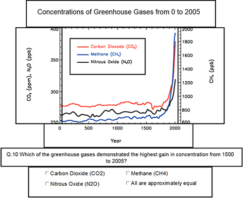
FIGURE 1. Screen capture of the defined AOIs used to assess fixation and search parameters. Graph source: Intergovernmental Panel on Climate Change (2007).
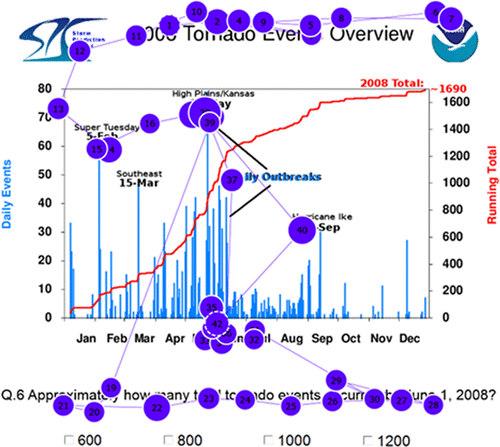
FIGURE 2. Example of a graduate student’s fixation path over the first 10 seconds of being presented a graphing task. The line is the eye movement, numbers indicate fixation order, and dot size represents the time spent fixated at that point. Graph source: National Oceanic and Atmospheric Administration (2015).
Description of Supplemental Data Collection
After completion of the ET sessions, participants completed a short questionnaire to gather information about their academic backgrounds (e.g., course work, career interests) and were interviewed to enhance data collection. As part of the larger data-visualization study, the semistructured interviews (Creswell, 2014) focused on a range of areas related to graphing practices—here, we focus on two question lines particularly relevant to this ET study that lend insight into potential differences in how participants interpret information. First, as expertise building through practice helps individuals recognize meaningful patterns of information (de Groot, 1965), participants were asked about their general experiences with graphing through the following questions: 1) In a typical week, how many graphs or charts do you read or create? [If needed] How many of these do you use to make decisions, communicate information, or solve problems? 2) Have you taken classes or had other training that explicitly taught you how to interpret or construct a graph? [If so] Can you describe the type of instruction or training on graphing you received? In the interest of ascertaining differences in how participants approach graph reading and interpretation, participants were asked: 3) When you are trying to read a new graph, do you approach it in a given way? [If needed] Can you explain the stepwise process—or order that you look at graph features—when first interpreting a graph? In addition to lending insight to their thought processes used in graph interpretation, the latter question also afforded the opportunity to compare the alignment between participants’ planned problem solving and their actual activities as measured via ET (a ground truthing of sorts).
Interviews, ranging between 10 and 20 minutes in duration, were conducted by one of two coauthors (C. Murray or C. Myers) with a written interview guide and transcribed verbatim. Coding for the selected questions reflected themes expected to appear in participant answers, graphing literature, our work in this prior area, and the prompts themselves. An open-ended iterative approach known as constant comparative analysis (Glaser, 1965) was used to identify and describe emergent themes within the transcripts. Each response was independently coded by two of the four coauthors (J.A.H., M.C., C. Murray, or C. Myers) with regular discussion to build consensus on the final codes and qualitative themes. Comparisons were drawn between expertise groups to address the research question.
RESULTS
To answer our research question—whether individuals along a continuum of expertise attended to graph data differently—we selected three common ET metrics to evaluate what differences, if any, exist between expertise groups in how they directed their focal attention when completing the graph-based tasks. First, the duration that participants spent fixated on AOIs was analyzed, per task. Closely linked to time duration (Duchowski, 2007), the second metric was the number of fixations (>200 milliseconds) per AOI over the duration of time spent on task. In addition, participants’ visual search activities were observed by analyzing the number of saccades (i.e., voluntary eye movements) to each AOI. These measures are of particular interest here, as the duration and number of fixations and directed eye movements indicate participants’ interest in or difficulties with parts of a visual stimulus during processing (e.g., Rayner, 1998; Duchowski, 2007; Ooms et al., 2014).
As mentioned in the ET session description, participants could work at their own pace, which led to notable variation in time spent on and the number of eye movements occurring during any given task. In light of this, we chose to normalize comparisons by computing percentages (e.g., the percent of time that a participant spent fixated on an AOI) relative to their total value (e.g., actual time spent on task) for each measure (cf. Slykhuis et al., 2005). These data were averaged across the 26 graph-based tasks and aggregated by expertise groups in an attempt to identify trends. As Figures 3–5 depict, all three measures suggest a general trajectory in how individuals direct their cognitive allocations in interpreting graph data as they gain expertise. Differences in measured values between expertise groups were statistically analyzed using the Kruskal-Wallis test as a nonparametric method due to the small and unequal sample sizes per group.
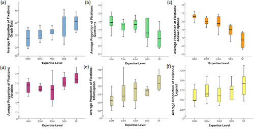
FIGURE 3. Box plots representing (thick line indicates median) average proportion of fixation time to (a) graph data, (b) questions, (c) answer options, (d) variables, (e) title/caption, and (f) legend AOIs by expertise. ET data were collected from 36 participants: 9 NSM, 7 ESM, 8 ASM, 6 SGS, and 6 SF.
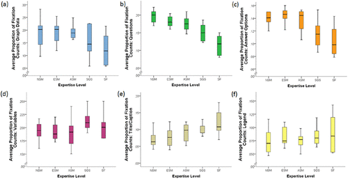
FIGURE 4. Box plots representing (thick line indicates median) average proportion of fixation counts to (a) graph data, (b) questions, (c) answer options, (d) variables, (e) title/caption, and (f) legend AOIs by expertise. ET data were collected from 36 participants: 9 NSM, 7 ESM, 8 ASM, 6 SGS, and 6 SF.
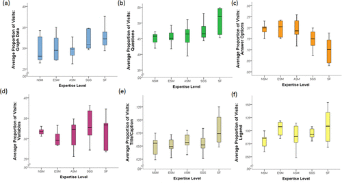
FIGURE 5. Box plots representing (thick line indicates median) average proportion of visits to (a) graph data, (b) questions, (c) answer options, (d) variables, (e) title/caption, and (f) legend AOIs by expertise. ET data were collected from 36 participants: 9 NSM, 7 ESM, 8 ASM, 6 SGS, and 6 SF.
The distribution of time spent fixated on answer AOIs (χ2 = 17.8, df = 4, p = 0.001) was significantly different among groups. Pairwise comparisons using Dunn’s test revealed significant differences in the graph information AOI fixation time between SF and NSM (p < 0.01) and SF and ESM (p < 0.05) in time spent fixated on answer AOIs. Less distinct but appreciable trends were also observed, as less experienced participants were more likely to spend more time fixated on the task questions and less time on the graph data, variables, graph legend, and title/captions than their counterparts with more expertise (Figure 3).
Using a Kruskal-Wallis test, we also analyzed differences between expertise groups based on the number (or count) of fixations >200 milliseconds in each AOI during completion of the graphing tasks. Significant differences were again noted among groups for fixations counts in answer AOIs (χ2 = 13.4, df = 4, p = 0.01). Dunn’s test for pairwise comparisons identified significant differences in fixation counts between SF and NSM (p < 0.05) and SF and ESM (p < 0.05). While not significant, stepwise trends are also notable across groups for count data in the variables, title text, legend, graph data, and question AOIs, as well as the collective graph information AOI (that bins variables, title text, and legends together) as a function of expertise (Figure 4).
In examination of subjects’ visual search activities, the distribution of saccades (or visits) toward question (χ2 = 15.72, df = 4, p < 0.01) and answer (χ2 = 12.44, df = 4, p = 0.05) AOIs were significantly different among groups. Pairwise comparisons using Dunn’s test revealed significant differences between SF and NSM in the number of saccades toward the answer AOIs (p < 0.01) and between SF and ESM (p < 0.05) in distribution of saccades toward the question AOI. Distribution of saccades toward the graph data, variables, legends, and title text between groups were not found to be significantly different; however, a noteworthy trend can be observed, as less experienced participants were less likely to visit these graph features than their more experienced counterparts (Figure 5).
Taking into account that individuals often group various elements of perceived meaningful information when problem solving (NRC, 2000), the AOIs central to understanding graph content/context (i.e., variables, title text, legends) were also analyzed as a single AOI (referred to here as “graph information”). While statistical differences between groups were not found in the reported metrics earlier when examined independently, significant differences as a function of expertise were apparent when these features were observed collectively. Here, the time spent fixated on (χ2 = 15.5, df = 4, p < 0.01; Figure 6) and the distribution of saccades (or visits) to the graph information (χ2 = 10.13, df = 4, p < 0.05) were significantly different between groups. Pairwise comparisons using Dunn’s test identified significant differences between SF and NSM (p < 0.01) and SF and ESM (p < 0.05) in time spent fixated on graph information. Similarly, pairwise differences were also found between SF and NSM in the number of saccades toward the graph information (p < 0.05). While not statistically different, an appreciable positive stepwise trend in the number (or count) of fixations >200 milliseconds toward the graph information as a function of expertise is apparent (Figure 6).

FIGURE 6. Box plots representing (thick line indicates median) the average proportion of (a) fixations, (b) fixation counts, and (c) visits to the graph information AOI. ET data were collected from 36 participants: 9 NSM, 7 ESM, 8 ASM, 6 SGS, and 6 SF.
Another more qualitative pass was taken to determine whether expertise group members attended to the graphing tasks differently based on display type. Figure 7 and Supplemental Figures 1 and 2 depict the proportion of time fixated per AOI (with graph information again combined into a single AOI) by three graph type bins,2 including 1) line charts (n = 9), 2) bar charts and histograms (n = 7), and 3) other graph types (n = 10, see Supplemental Table 1 for the variety of “other” types used in the study). While statistical comparisons between expertise groups are limited with the ET data disaggregated by graph type, the observed general trends are consistent with the earlier results (Figures 3 and 6) in how individuals direct their focal attention during graph interpretation as a function of expertise.
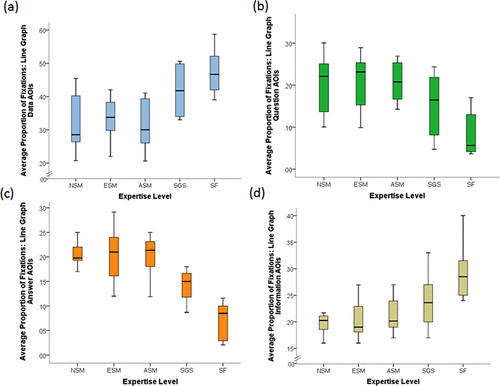
FIGURE 7. Box plots representing (thick line indicates median) average proportion of fixations for line charts to (a) graph data, (b) questions, (c) answer options, and (d) graph information AOIs by expertise. ET data were collected from 36 participants: 9 NSM, 7 ESM, 8 ASM, 6 SGS, and 6 SF.
These differences in search patterns become more striking when comparing individual participants’ eye-movement pathways depicting the sequence of fixations and duration over a given time period. Figure 8 illustrates the initial eye movements of a representative faculty member (red line), advanced science major (orange line), and non–science major (blue line) over a standardized 20-second time interval when starting a new graphing task. The lines represent the participants’ eye movements through the AOIs for a single (randomly) selected graph. Here, the faculty member demonstrates a more directed approach focusing on the graph information and data, whereas the student search patterns are more sporadic. Between students, the advanced science major’s eye movements oscillated among AOIs, while the nonmajor’s attention was frequently directed to the question and answer.
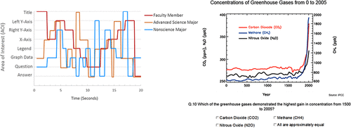
FIGURE 8. Representative pathway example of how an SF, ASM, and NSM directed their attention when faced with the graphing task seen to the right. The lines represent the subjects’ AOI fixation order and duration during a standardized period of 20 seconds (given subject variability in time on task) after initially being presented the graph. Graph source: Intergovernmental Panel on Climate Change (2007).
To lend insight to the observed similarities and differences in eye movement between participant groups during graph interpretation, we identified several themes that emerged from our interview transcripts relating to participants’ graphing experience and thought processes. First, while all participants reported daily exposure to graph data through various avenues (e.g., social media, course work, research), there was a notable positive trend between expertise level and meaningful graph usage (i.e., interpretation or drawing of graphs) in problem solving on a weekly basis. Most SF self-reported—on average—using multiple graphs each day followed by SGS (1–2/day), ASM (3–4/week), ESM (1–2/week), and NSM (rarely or <1/week). Also related to their graphing experience, ∼30% of participants (n = 11) reported having a course or other training related to graph drawing and interpretation. Of these “trained” respondents, approximately half were SF (n = 3) and SGS (n = 3) who identified explicit graphing instruction through research and graduate courses, whereas ASM (n = 3) and ESM (n = 2) reported implicitly learning through practice in their course work. The following comment represents this view: “I guess in chemistry [as] we did graphs all the time and he wanted them in a pretty specific ways that he could read them quickly or whatever. Yeah, I guess the practice helps. Just repetition to get better with time” (third-year biology student).
Interview data revealed similarities and differences across participants’ thought processes when interpreting graph data. Figure 9 summarizes the first three self-reported steps3 by participants in graph interpretation. Across expertise groups, all participants identified similar pathways in their planned or intended actions that focused first on contextual information (title/caption, variables) before directing their attention to the graph data or the question presented. While comparisons of the interview responses and ET data from three randomly selected graphs (including the graph seen in Figure 8) largely confirmed the faculty and graduate student participants’ strategies (i.e., they did what they said they did), variations in underlying thought processes between the planned and actual actions for the more novice-like groups were revealed. Despite having intended plans comparable to the higher expertise group members, undergraduate (NSM, ESM, and ASM) students lacked alignment between their planned and actual intentions to some degree—often initially depending on cues or the graph data to make sense of the image.
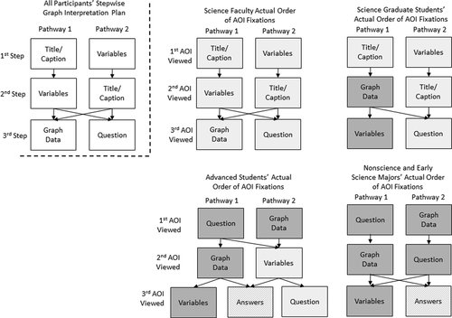
FIGURE 9. A comparison of participants’ self-reported and actual actions in graph interpretation by expertise groups. The pathways to the left of the dotted represent the first three steps in graph interpretation as outlined in by participants during interviews. The pathways to the right of the dotted line represent group members’ first three AOIs viewed as measured by ET for the graph in Figure 8. The light gray shaded boxes represent alignment in order between predicted and actual actions, while the dark gray shaded boxes indicate a lack of alignment. Line hatching designates viewed AOIs that were not discussed by participants in the interviews.
DISCUSSION
In this study, eye-movement data were used to examine how individuals along a continuum of science expertise (non–science majors, early science majors, advanced science majors, graduate students, science faculty) differ in making sense of “everyday” science-related graphs. Generally, based on aggregated visual fixation (time spent and number of fixations) and search patterns (number of saccades), as participants’ experience levels increased, more attention was allocated toward contextual elements (i.e., graph title/caption, variables, legend/key, and data source) that might inform their understanding of the image as well as the graph data relative to their move novice-like counterparts. On the other hand, as experience level decreased, participants were more likely to focus their attention and rely on cues (provided answer options and question prompts) in an effort to complete the graph-based tasks than more expert participants. Our data are consistent with earlier expert–novice ET studies4 focusing on discipline-specific or specialized graph data (Atkins, 2016; Topczewski et al., 2016) as well as findings reported by Angra and Gardner (2017), who noted in their research on graph construction that experts are more likely to take the time to understand the data before using them.
We also saw differences along the expert–novice continuum in participants’ sequence of fixations (i.e., what they looked at and when). Generally, as expertise increased, participants were more likely to display directed search patterns by initially focusing on contextual and graph data features; whereas less experienced participants demonstrated more sporadic search patterns that oscillated between task-based cues (i.e., prompts, provided answers) and other image elements. Comparisons of participant eye movements and supplementary interviews highlighted differences between expertise group members in their intended and actual cognitive strategies when faced with a new graph interpretation task. While all participants in these groups described comparable strategies for graph interpretation, an appreciable shift appeared between the search actions proposed by undergraduate students (NSM, ESM, and ASM) and how those students actually attempted to navigate images. In comparison, faculty and graduate student intentions largely aligned with their exhibited actions. One interpretation might be that undergraduate students are instructed how to “see” graph data, but the breakdown in practice with everyday science-based imagery suggests the lack of rehearsal or difficulties in transferring their skills to situations outside the classroom.
While previous research provides a foundation to the challenges experts and novices face in graph analysis, few studies have assessed the cross-sectional skills of science students and practitioners in making sense of graphs. Studying how participants across the expert–novice continuum read and interpret graphs deepens our understanding of skill progressions and can inform instructional activities to help novices demonstrate more expert-like practices. Our findings lend further support to calls for the incorporation of learning experiences that hone students’ graph analysis and, more broadly, quantitative reasoning skills in the college science classroom (AAAS, 2011).
There are many published examples of short-term interventions (e.g., Harsh and Schmitt-Harsh, 2016) and semester-long curricula (e.g., Picone et al., 2007; Speth et al., 2010) that highlight key design features for teaching graphing, including engaging students in the active collection of data for graph analysis, exposure to “messy” data, using a two-step data analysis approach, collaborative practices, and explicit graphing instruction. With respect to explicit graphing instruction, Angra and Gardner (2016, 2017) emphasize the importance of the design and implementation of instructional scaffolds that target student difficulties with conceptual (i.e., understanding the purpose of a graph), procedural (understanding the stepwise processes in making sense and using graphs), metacognitive (self-reflection on graphing practices), and strategic (considering alternative problem-solving approaches) difficulties. As an example of how such scaffolding can be readily incorporated into the classroom setting, in his large introductory biology class, the lead author (J.A.H.) presents students with graph data in a stepwise manner to mirror the general procedural process demonstrated by experts in this study (as represented in Figures 8 and 9). First, reflective of how experts initially direct their attention toward graph information when faced with a new graph, only the graph framework (e.g., axes, scale) and contextual features (e.g., variable labels, title/caption) are provided, and students are prompted to collaboratively describe what data are to be represented and to make predictions based on their prior knowledge. In the second step, students are provided with the graph data and are asked to evaluate the general relationship being demonstrated. Next, students are asked a specific question regarding the graph data and are given a set of possible answers to select from, and student selections are captured via class polling (clickers). Finally, conversations about reading the graph data at the levels outlined by Curcio (1987; i.e., reading the data, reading between the data, and reading beyond the data) are held, with the lead author modeling graph-reading practices as needed to help attend to proficiency gaps (Shah and Hoeffner, 2002; Picone et al., 2007).
There appear to be four general constraints for this study. First, while the sample size here is toward the higher end of what is commonly found in ET studies, our findings may be restricted by the number of expertise group members. By its nature, ET research is intensive (i.e., participant recruitment; collection and analysis of data points generated every 30–60 milliseconds), and the use of small samples sizes is considered appropriate when studying observable behaviors (cf. Slykhuis et al., 2005; Tai et al., 2006; de Koning et al., 2010). Our results lend unique insight to how individuals with various levels of expertise make sense of graphs; however, it would be beneficial for future research to collect data from a greater number of subjects to afford a more detailed characterization to the development of graph interpretation skills. Second, the layout of the graphing tasks to include multiple-choice answers may have inadvertently influenced how participants directed their attention in the search for information. The decision to use this type of design, as discussed earlier, was—in part—to align with existing data-visualization tests and for the purpose of structural familiarity for the participants. Other common types of response formats may limit measuring eye movements (e.g., typing open responses can lead to data loss as subjects look between the screen and keyboard; thinking aloud can affect behavior). A potential option in future research could be to temporally separate the presentation of the graph task and answer options (or other response format) in a manner more closely reflecting how one may “naturally” interpret graphs (i.e., without provided answers). Third, for convenience and accessibility, participants were recruited from a single comprehensive institution, which limits study generalizability. Even so, our results are consistent with a smaller pilot study conducted at a large research-intensive university (Harsh and Maltese, 2013), and it seems reasonable to conclude that our findings are broadly relevant within college science education. Fourth, the current study lends insight into differences in how individuals of differing levels of expertise direct their attention when faced the reading and interpretation of everyday science-related graphs; yet answering how these differences came about is beyond the scope of this work. Further investigations are critically needed to discern how activities in research and instructional spaces contribute to learners’ progressions in making sense and using graph data. Future work will also continue to explore how students and scientists read other forms of data visualizations and to examine common missteps that respondents may make when incorrectly interpreting data.
We are thankful for the contributions of the participants who joined us in this study and the thoughtful feedback provided by Stephanie Gardner, the monitoring editor, and the two anonymous reviewers with regard to this article. This project was supported in part by the James Madison University Biology Department and College of Science and Mathematics. The interpretation of this work benefited from the ACE-Bio Network (NSF RCN-UBE 1346567).
FOOTNOTES
1See NRC (2000) for a comprehensive review as to how experts and novices differ in learning and problem solving.
2These three bins were selected for their structural properties and, given the variation between graphs (e.g., task difficulty), to maintain comparable numbers of graphs per category for analysis purposes.
3The selection of three steps here to explore participants’ thought processes was threefold. First, we predicted it would be a manageable number of steps for participants to recollect and/or have planned. Second, order of attention often indicates participant interest or priority in a given feature (Ooms et al., 2014)—beyond the third step, there was substantial variation in participant thought processes. Third, several participants completed one or more of the graphing tasks in three steps.
4It should again be noted that prior ET studies have largely used advanced majors and graduate students as experts for comparative purposes.


