Communicating Complex STEM Program Evaluation to Diverse Stakeholders
Abstract
Visual representations, such as pathway models, are increasingly being used to both communicate higher education science, technology, engineering, and mathematics (STEM) education program evaluation plans as well as accurately represent complex programs and the systems within which the educational programs reside. However, these representations can be overwhelming to audiences that are not familiar with the program’s structure or engaged in the evaluation process. The goal of this methods essay is to help both evaluators and discipline-based education researchers improve communication about program evaluation with a variety of stakeholders. We propose a three-stage method for developing progressively less complex visualizations to build affordances that help make the program evaluation process and statements of program impact more meaningful to a wider range of audiences. The creation of less complex visualizations can facilitate understanding by allowing a stakeholder to more easily “see” the structure of the program and thereby may evoke a greater willingness to take action and make meaningful programmatic changes based on strategic evaluation planning. To aid readers, we describe how we modified the Systems Evaluation Protocol (SEP) to develop simplified visualizations when evaluating a long-standing college science faculty development program, the Summer Institutes on Scientific Teaching.
INTRODUCTION
Collaboration, when planning and conducting evaluations, requires evaluation experts to be judicious in how they engage and communicate with program leaders and stakeholders. The overall evaluation plan must be clear to all audiences, whether internal or external, even though they may differ in their familiarity with the program or evaluation processes in general. Effective communication allows the evaluator to take a participatory approach, which is critical to increasing buy-in and has the potential to enhance the quality of the evaluation and thereby contribute to program improvement (Brisolara, 1998).
In higher education science, technology, engineering, and mathematics (STEM) contexts, many stakeholders are scientists who are interested in education topics and tend to be more familiar with research design than evaluation design, the latter of which often occurs in natural settings and by necessity contains fewer experimental controls. Unlike research, in evaluation, specific results may not necessarily generalize to other programs. The purpose of evaluation is to critically examine the functioning of a particular program, with an awareness of the complex system in which it resides, so that specific improvements can be made in order to achieve desirable outcomes.
One approach to bridging the “research–practice divide” when communicating involves the use of visualizations. The use of visualizations to improve communication has been studied in several contexts and has been shown to make messages easier to perceive and remember (Torres et al., 1997; Mayer and Moreno, 2003; Few, 2009; Ware, 2012). From a cognitive perspective, visual representations, especially when combined with a verbal explanation, can help reduce barriers to comprehension and are used to increase interest in the process (Mason and Azzam, 2019; Weinstein et al., 2018).
Program evaluation of large-scale education reform efforts in postsecondary STEM can be a complex and multifaceted endeavor. Going beyond a text-driven logic model to create a visualization of a program with a systems-focused map may evoke increased understanding among stakeholders and a greater willingness to take action and may potentially result in programmatic improvements. For example, the Systems Evaluation Protocol (SEP; see Cornell Office of Research on Evaluation, 2016) allows evaluators to visually represent a complex program and systematically develop approaches for assessing it by creating a causal pathway model, a process we will refer to as “program mapping.”
The idea of program mapping is to provide a way for stakeholders to better “see” how a program is structured and how it can be evaluated. Mapping a program depicts the connections (via arrows) between different elements that are traditionally included in a logic model, such as program activities and short-, medium-, and long-term program outcomes (presented as boxes). When compared with the logic model’s traditional column and row presentation, the pathway visualization in a program map allows stakeholders to track the progression of outcomes through the program and understand that several stages of activities and intermediate goals must be completed en route to long-term success. A pathway model has also been referred to as a “network of logic models that describe the larger system” (Urban and Trochim, 2009, p. 543). The map displays the multiple pathways that contribute to any single outcome and can expose feedback loops by visualizing recursive connections. Furthermore, the mapping process helps illustrate key measurement points, identified as points where many connections converge.
The process of program mapping can be applied to programs of all sizes, although it may be more beneficial in larger, more complex programs. Early efforts with mapping focused on evaluation of module-based education programs in materials science (see, specifically, Figure 2 in Urban and Trochim, 2009). In the discipline-based biology education research literature, this approach has also been used to map the available literature focused on course-based undergraduate research experiences and to guide discipline-based education researchers in making distinctions between traditional and discovery-based laboratory courses (Corwin et al., 2015). More recently, program mapping was used to define and assess student success in an inclusive research and education community program for phage biology discovery (Hanauer et al., 2017). Ongoing efforts also aim to map large, networked graduate student and postdoctoral training programs in order to build evaluation capacity and identify opportunities for cross-network measurement (Bauer et al., 2019).
However, mapping complexity comes with a caveat when it needs to be used as a communication tool. Because program maps depict the full complexity of a program, interpretation becomes more challenging as the size and intricacy of the program increases. In general, the cognitive and educational psychology literatures suggest that, when visual information is confusing or the main message is not obvious, it requires more work for individuals to comprehend (Fazio and Petty, 2008). When a threshold of complexity is reached for an individual, then the representation essentially becomes abstract and less accessible (Nisbett, 1993). Essentially, the benefits of using a visualization can decrease as the complexity of the visualization increases. This presents a problem for evaluators: While the benefit of mapping is that the complexity of a program can be identified and therefore “seen” more clearly by the evaluation team, the map, in its original form, may be too confusing or abstract to afford the same insight or benefit when shared with stakeholders who are not as familiar with the detailed program structure or who were not as deeply engaged in the program map’s creation.
Therefore, a simpler visualization of the original program map may need to be created in order to make it more immediately accessible to a wider range of audiences. The published SEP approach does not currently include techniques for simplifying program maps for the purpose of engaging and communicating with diverse program stakeholders. While evaluation research provides guidelines for presenting the results of evaluation to stakeholders and external audiences (Azzam et al., 2013; Evergreen, 2013), there is less focus on how to communicate the evaluation process.
To address both of these gaps, this essay proposes a method for developing simplified visualizations that complement the SEP and improve communication about the evaluation with diverse stakeholders. The process involves the creation of progressively less complex visualizations in three stages. It is important to note that the process must start with the development of a full pathway model (i.e., “program map”)—representing the program in all its complexity—for the subsequent simpler visualizations to be created. Therefore, the stages are presented in this essay in the order of development, which may differ from the order in which the visualizations are presented and communicated in practice.
The order of communication will depend on the audience’s level of engagement with and knowledge of the program. For some audiences, it may be more appropriate to start with the simplest visualization. Then, when appropriate, the more complex visualizations (or parts therein) can be unveiled to stimulate deeper conversations and demonstrate the complexity of the program and evaluation process. To aid readers, we will describe how we applied each of these visualization and communication strategies to a long-standing college science faculty development program, the Summer Institutes on Scientific Teaching.
APPLICATION/METHODS
Context
We used the SEP (Cornell Office of Research on Evaluation, 2016) to build a pathway model for a nationwide science faculty development program called the Summer Institutes on Scientific Teaching (see www.summerinstitutes.org), which has been in existence since 2004 through support from the Howard Hughes Medical Institute (HHMI). Through 2017, more than 1700 college science faculty and instructors from more than 350 institutions have participated in this 4-day intensive pedagogical training. The training, which is administered by trained faculty facilitators at different campuses across the United States, aims to help current faculty incorporate evidence-based teaching (EBT) practices into their own college science classrooms (Handelsman et al., 2007; Pfund et al., 2009). Workshop curricula focus particularly on EBT practices for science faculty who teach large introductory STEM courses for degree majors.
Faculty participants at the Summer Institutes (SI) are instructed on principles about how people learn, how to use a variety of teaching methods to engage students, how to create an inclusive learning environment, and how to assess their students’ learning progress (Handelsman et al., 2007). For example, faculty participants learn how to design lectures from well-defined learning goals and objectives, a process described by Wiggins and McTighe (2005) as “backward design.” Faculty participants also learn how to choose from various activities to engage students, how to consider diverse types of learners, and how different teaching approaches can engage learners with different social/ethnic backgrounds and learning styles.
Our SI evaluator–stakeholder team (i.e., “working group”) included the broader group of researchers and institutional stakeholders who are the primary beneficiaries of the SI program. This research team consisted of project collaborators (n = 10) from five institutions: Cornell University, the University of Colorado–Boulder, the University of Connecticut, the University of Nebraska, and Yale University. Their combined expertise includes four fields of study: program evaluation, higher education research, science and science education research, and educational psychology. This work was supported by a National Science Foundation grant (NSF ID no. 1323258).
The visualizations described in the next section were used as communication tools with the following three internal stakeholder groups: 1) regional SI program leaders, who were responsible for organizing the annual training activities on their campuses and who attended biannual SI planning meetings; 2) local SI program facilitators, who were not involved in program planning but who helped implement the training activities at each campus; and 3) the SI executive leadership board and the SI program officers from the agency funding the SIs, who read annual reports and received in-person updates on the SIs. Additional individuals who viewed at least one visualization included campus administrators (who provided logistical support for the SIs) and conference attendees (where SI evaluation and research data were presented).
Stages of Program Map Development
Stage 1: Full Pathway Model.
The pathway model (or program map) creation and overall program evaluation of the SI followed the SEP procedures (Cornell Office of Research on Evaluation, 2016). This included the use of the SEP’s corresponding cyberinfrastructure tool called the Netway (www.evaluationnetway.com), which is a publicly available software platform for implementing all steps of the protocol. The pathway model development process involved first identifying the program’s activities along with the expected short-, medium-, and long-term outcomes using a classic logic model framework. These program activities and outcomes become the “nodes” (or boxes) in the pathway model. The nodes are connected with directional arrows that indicate temporal relation. Program activities are connected to short-term outcomes; short-term outcomes are connected to other short-term outcomes and medium-term outcomes; medium-term outcomes are connected other medium-term outcomes and long-term outcomes; and long-term outcomes are connected to other long-term outcomes. Additionally, feedback loops can exist from, for example, a long-term outcome back to a short- or medium-term outcome. When all of the activities and goals have been identified, they can be uploaded in to the online modeling software to generate a program map like the one seen in Figure 1 (all figures are available as Supplemental Material online that can be magnified for closer examination of smaller details, including the language in each of the specific nodes).

FIGURE 1. Stage 1: Full pathway model for the SI program.
Creating the map is an iterative process. In our case, to generate the map of the SI program, the evaluation team first completed a thorough review of SI curricular materials, existing evaluation data, and associated literature to create a preliminary pathway model. This map was then reviewed by the evaluator–stakeholder team. The model was revised several times until there was agreement among the SI stakeholders that it accurately represented the program. Those involved in this model creation and revision were the members of the evaluator–stakeholder team and were deeply familiar with the goals and structure of the program.
Stage 2: Zoned Pathway Model.
In our experience, discussing the full pathway model with interested stakeholders who were not part of the core evaluator–stakeholder team often caused confusion when the model was initially presented, due to the model’s size and complexity. We realized that some stakeholders needed additional instruction on how to interpret the model, review the model, and identify which aspects of the map to focus on. Even after we spent a considerable amount of time providing these explanations, stakeholders would often hone in on areas of the program with which they were most familiar, critique small details (i.e., semantics), and struggle to see the larger picture. To reduce the amount of time needed to present the content of the full program map and to focus the discussion when working with the larger group of regional SI program leaders, we began grouping like items in the program map into higher-level categories we called “zones.”
The identification of zones is analogous to conducting a thematic analysis in a qualitative research study (Braun and Clarke, 2006) and involves categorizing and naming regions of related elements in the full program map. We used the general approach of grouping activities and outcomes based on their actors, receivers, subjects, and/or timing. We considered what concept the activity/outcome addresses, who is generally involved in or impacted by the activity/outcome, and when the activity/outcome occurs relative to other activities/outcomes. The zoning process was iterative; we began by coding each activity and outcome in the full pathway model (per the characteristics described above—e.g., actor, receiver), then progressively grouping like activities/outcomes into zones, and finally assigning a summary title to each zone (Figure 2).

FIGURE 2. Stage 2: Zoned pathway model for the SI program. The themes for individual zones are as follows: Zone 1: Activities and outcomes at the SI. Zone 2: SI participants implement new teaching methods in their own classrooms. Zone 3: Immediate changes to student learning experience. Zone 4: Greater changes to student learning and development. Zone 5: Large change to teaching experience. Zone 6: Large change to student experience. Zone 7: Participants promote institutional changes. Zone 8: Institutional changes gain momentum. Zone 9: Improved retention and diversity. Zone 10 : Broad shifts in how teaching is viewed in science. Zone 11: Changes to science and society.
For example, in the SI map, the “student” and “instructor” outcomes were broken apart into zones according to the expected order in which the outcomes occur—for example, with those student outcomes happening immediately in the classroom grouped together (zone 3), then those happening more indirectly and in the medium term grouped next (zone 4), and those happening in the long term grouped separately from the others (zone 6). In this way, we grouped common map elements together, breaking the overall map into puzzle pieces, with each puzzle piece representing a theme. The zones allow for a simpler viewing of the progression of themes across the map. In other words, they represent the program’s overarching “story” from activities through successive effects over time. For instance, it illustrates how adoption of new teaching methods by instructors (zone 2) leads to better student learning (zones 3 and 4) and, ultimately, to increased student retention (zones 6 and 9).
The final zoned model reduced the visual complexity of the full program map. In the SI example, the full program map included 11 program activities, 21 short-term outcomes, 71 medium-term outcomes, and 15 long-term outcomes. These were reduced to 11 final zones that were used as an overlay on the full program map. The smaller number of zones was easier for stakeholders to cognitively process and helped us to focus discussions on the overall evaluation plan. Then we were able to systematically move through each zone to have more detailed discussions with individual stakeholders based on their familiarity with specific aspects of the program.
Stage 3: Simplified Box Models.
While the 11 zones overlaid on the full program map helped identify broad themes and were useful for communicating with the regional SI program leaders, further simplification was beneficial when presenting to program stakeholders less involved in program development and evaluation (i.e., local SI program facilitators, the SI executive leadership board, and SI program officers) and external audiences (e.g., campus administrators, conference attendees). The zoned pathway model provided stakeholders with the opportunity to provide feedback and critique the underlying program map, albeit in a more focused manner. However, not every audience will be able or interested in doing so. For example, campus administrators and local SI program leaders at each SI location were interested in the overall structure of the program and the evaluation plan but did not need all of the details available in the zoned pathway model to implement the program.
To communicate with these stakeholders and external audiences, we converted the zoned pathway model into a simplified box model. The simplified 11-box model (Figure 3) puts each zone into a more uniform linear sequence using a progression of boxes from left to right. The 11 boxes in the simplified box model represent the same 11 zone overlays from the zoned pathway model (Figure 2). As such, this simplified box model presents the zoned overlay pathway model in a less visually burdensome and more chronologically intuitive manner. It includes program activities and short-term SI program outcomes in the box on the left, medium-term outcomes in the central boxes, through to long-term outcomes in the boxes on the right.

FIGURE 3. Stage 3: Simplified 11-box model for the SI program.
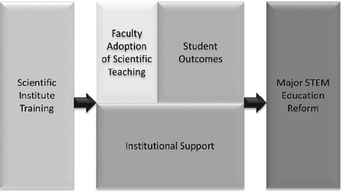
This box model was then further simplified from 11 boxes (Figure 3) down to five boxes (Figure 4). To accomplish this, we analyzed the content of the 11 boxes and grouped those that contained similar activities or outcomes. For instance, two faculty outcomes (“SI Participants Implement New Teaching Methods in Their Own Classrooms” and “Large Changes to Teaching Experiences”) were combined into one box (“Faculty Adoption of Scientific Teaching”). This five-box model represents the simplest version of the pathway model that we created, which was used most frequently with external audiences (e.g., at conferences and grant agency meetings).

FIGURE 4. Stage 3: Simplified 5-box model for the SI program.
Stakeholder Experience
Even though the communication of evaluation processes has been examined less than the communication of evaluation results (Azzam et al., 2013; Evergreen, 2013), support for using visualizations to increase comprehension comes from research in cognitive psychology, educational psychology, and communication studies (Torres et al., 1997; Few, 2009; Ware, 2012). Nevertheless, this requires the message being presented by the visualization to be obvious to the viewer (Nisbett, 1993). Complex visualizations like pathway models require high-level processing for comprehension (Fazio and Petty, 2008). They are necessary in order to conduct high-quality evaluation, but they are best used by the evaluator with program stakeholders who were involved in their creation and who possess a high degree of program knowledge. Sharing this most complex program visualization with less-involved stakeholders will likely be less successful, and potential insight gains and evaluator–stakeholder efforts expended to create the pathway model may be shortchanged.
The model development process we have outlined was developed through trial and error, and our recommendations are based on the reactions that we received when working on this and other SEP-based projects. To provide examples that illustrate how stakeholders’ perceptions of the evaluative process changed as we introduced each visualization, we asked some stakeholders to reflect on their experiences with each model. Their thoughts are represented by a few quotes that we include here and illustrate how our revisions addressed their specific concerns.
When we first started presenting the pathway model, we struggled to get our message across to stakeholders, as indicated by the following statements from regional SI program leaders about the full program map:
“I never really understood the big picture of the SI evaluation model, [or] any of the pieces that made up the model.”
“When I first saw it, I could see there was a lot of thinking going into it; but what wasn’t clear to me (and to others) for a long time where were the best places to measure and why.”
“The visuals also seemed overwhelming at times in that at first they were not organized in a manner that made sense to an outside audience.”
The frustrations that arose when presenting the full map to regional SI program leaders contradicted the feedback we were getting from members of the evaluator–stakeholder team, who helped develop the model and saw the value in embracing complexity:
“The discussion and thinking that went into developing the complex pathway model allowed me to develop a new and deeper level of understanding of the program, which then allowed us to ask the ‘right’ (most useful, appropriate, and feasible) evaluation questions about the program.”
“Without complexity, pathway models will drive over-simplified, less useful, and sometimes inappropriate evaluation questions, which wastes time and resources.”
Therefore, it was incumbent on the evaluators to revise the communication strategy. After several iterations, the zoned and simplified box models helped us more effectively describe the program structure and desired outcomes as well as the evaluation process to individuals who were not involved in the development of the full model:
“The simplified model…gave a clear, concise view of the model as a whole and also showed how each piece worked and fit together.”
“The visuals helped me consider the temporal aspects of the project and the order in which measurements should occur. They were partitioned into sections [that] helped me think of phases of work rather than an overwhelming plethora of options”
“I came to appreciate the folly of measuring an outcome at point ‘E’ that I expected to result from an intervention at point ‘A’ without understanding how or if that intervention impacted steps ‘B–D.’ [I find it effective to] start with the ultimate outcomes and work backward through more medium- and short-term outcomes that are necessary to reach the ultimate goal.”
These quotations were collected post hoc through recent interviews with members of the evaluator–stakeholder team and additional regional SI program leaders, but the sentiments expressed by these individuals reflect our perceptions of how each visualization was received and understood during various meetings and presentations at the time. Additional research would need to be conducted to determine whether these conclusions are representative of other stakeholders who engaged with these visualizations and how similar visualizations would be perceived in different evaluative contexts.
Within the spectrum of models ranging from the most complex to the simplest, we recommend that audiences and stakeholders be presented the visualization that is appropriate to their levels of understanding of the program and evaluation processes (Table 1). More complex visualizations can be shown later, as needed, to support the proposed evaluation plan and answer questions about how the model was developed or how the evaluation implementation will proceed. We reiterate that the series of overlays presented in this essay can only be accomplished if the evaluation team starts with creating the complex pathway model, which then allows for creating simpler visualizations. While it may be more productive to present or communicate the simplified visualizations, it is the original program map that fully represents the program and will need to be returned to in order to elucidate “gaps” or programmatic needs and when creating strategic evaluation plans. An SI program evaluator summarizes our process well and includes words of warning:
“While complexity serves the first two purposes of pathway modeling (planning and evaluation) very well, it can hinder the model’s (and its creators’) ability to communicate the essence of how the program is believed to work. However, program staff, evaluators, and anyone using pathway models as a tool should beware the pitfalls of crossing these purposes or doing this work out of order. Simplified models should always be derived directly and faithfully from their full-size counterparts and evaluation questions should never be derived from simplified models.”
| Development stage | Purpose | Complexity and audience | Development process |
|---|---|---|---|
1: Full pathway model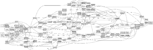 | Represents the complexity of the program and illustrates the connections (arrows) between activities and different levels of outcomes (boxes/nodes). |
| Follow the guidelines in the SEP manual. |
2: Zoned pathway model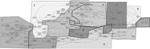 | Focuses discussion on major themes and reduces the amount of time needed to explain the pathway model. Still allows stakeholders to provide feedback on the pathway model. |
| Identify major themes. This step is similar to conducting a thematic analysis. Group activities and outcomes based on their actors, receivers, subjects, and/or timing. |
3: Simplified box models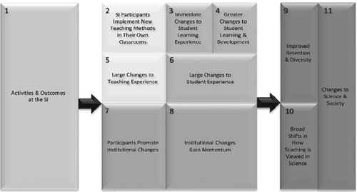 | Presents the zoned pathway model in a more chronologically intuitive manner and reduces the visual burden caused by all the nodes. |
| Each of the numbered zones from the previous step receives its own box. The arrows indicate progress from activities and short-term outcomes to medium- and long-term outcomes. |
 | The boxed model can be simplified further to present a very broad picture of the program and evaluation plan (i.e., Measure A, then B, then C; see Figure 5). |
| Common levels of outcomes and populations from the 11-box model are merged. |
CONCLUSIONS
At the outset of this methods essay, we described why it is important that stakeholders engage with their evaluation models (on some level) so that they can “see” their programs and come to possible realizations or insights about their structures and impact. To address barriers associated with interpreting complex visualizations, the SEP will need to evolve to include reasonable additions to the protocol. We have identified some of these potential additions in the form of simpler program visualizations to balance comprehensiveness with clarity. The examples provided from our experience with the SI program evaluation helped us communicate the program structure, its intended outcomes, and our evaluation plan to different audiences with different levels of involvement with the SI.
In the SI example, the zoned pathway model was used by the evaluator–stakeholder team for drafting evaluation questions as well as with regional program leaders who were involved in program development and planning. As a user-friendly and visual “storefront,” the zones are a logical extension of the program map. The zoned pathway model retains the complexity of the full pathway model while reducing the amount of visual burden for a stakeholder trying to interpret the original pathway model. Through this process, these stakeholders were able to focus on a specific zone, instead of attempting to simultaneously comprehend every outcome in the pathway model. It also helped to focus the literature search, evaluation question drafting, and evaluation plan timeline generated by the evaluator–stakeholder team.
The simplified box models were used with local SI program facilitators, who were involved more in program implementation than planning, as well as with external stakeholders (e.g., SI executive leadership board, program funders, academic conference audiences) to provide a quick overview of how different aspects of the program related and depended on one another, without requiring a deep knowledge of the program itself. Stakeholders were walked through the model in Figure 5 and could see the importance of first measuring fidelity of instruction during the SI by referring to the box representing SI training activities (“A”) before measuring faculty adoption and implementation of scientific teaching practices (“B”), and later the subsequent impact that using new teaching practices could have on student outcomes (“C”). The linear sequence presented in the simplified box model helped convince stakeholders that, in order to make claims about the program’s impact on “C,” the implementation and intermediate steps needed to be understood. Fruitful research questions emerged from this discussion, and literature reviews were centered on the boxes and the transition points (“A → B” and “B → C”) as the narrative of the program unfolded and could be “seen” in the simplified zone model (see the following research studies that emerged from this evaluation planning: Cavanagh et al., 2016, 2018; Aragón et al., 2017, 2018).

FIGURE 5. Simplified box model for the Summer Institutes program with A→ B → C research stages
The purpose of this methods essay was to provide program evaluators and leaders who may be potential users of the SEP or a similar comprehensive program mapping approach with a method for transforming complex program models into simplified visualizations. This simplification is especially important in order to effectively communicate with different audiences and stakeholders about program structure, evaluation processes, and outcomes. The modifications of the SEP outlined in this paper allowed us to improve clarity in communication and evaluation planning with one such program, a teaching professional development program called the Summer Institutes on Scientific Teaching. Additionally, by creating and going through this process, we gained novel insights into and made critical modifications (i.e., additions) to our program evaluation approach, which we continue to apply with other STEM education evaluation projects. While the new visualizations and simplifications allowed us to more quickly and clearly communicate our evaluation plan with different stakeholders and audiences of this program, additional research should be conducted to evaluate the effectiveness of this approach in other scenarios and in relation to other evaluation processes. Other evaluators and stakeholders should adapt these methods to their programs and continually describe any new benefits or challenges that arise to help facilitate improved evaluation and communication strategies. We encourage readers to refer to the full SEP (Cornell Office of Research on Evaluation, 2016) for additional source materials when adapting this process for their work.
ACKNOWLEDGMENTS
Research that contributed in part to this paper was made possible through an NSF Transforming Undergraduate Education in STEM grant (NSF no. 1323258) and an HHMI professors grant originally awarded to Jo Handelsman. We thank our collaborators on this grant, including Xinnian Chen, Brian Couch, Mary Durham, Jennifer Frederick, Monica Hargraves, Claire Hebbard, Jennifer Knight, Jessamina Blum, Michelle Withers, Clarissa Dinks, Jane Buckley, and William Trochim, and we acknowledge Jonathan Waterhouse for contributions to Figure 4.